
In the Proactive Advisor Magazine article “Bonds are not carrying their weight. Looking for an alternative?” from earlier in 2021, we pointed out that bonds contributed just 15% to the return of a traditional 60% equity/40% bond allocation for the past decade, versus 35% for the period from 1989 to 2010.
We think Warren Buffett was proven correct when he stated a decade ago in the 2011 Berkshire Hathaway shareholder letter that “right now bonds should come with a warning label.”
The traditional 60/40 allocation worked so well for decades for this simple reason: The bond market was in a long-term secular bull dating back to the late 1980s. Bond yields were in double digits, offering extremely competitive returns to stocks. Also, as rates gradually fell, bond prices rose (bond prices and yields move inversely). So, bond investors benefited in two ways: high rates to start with and rising bond prices as yields declined.
Bonds were a great counterweight during large equity declines in 2000–2002 and 2008–2009. That helps explain the popular wisdom of a 60/40 equity-bond mix for the past several decades. However, as Buffett sounded the warning, that successful combination no longer existed. Rates were low and further price appreciation was limited. In fact, bonds may have moved to “the most dangerous of asset classes.”
In Warren Buffett’s 2013 letter to Berkshire Hathaway investors, he noted that he had instructed the trustee of his wife’s inheritance to be allocated 90% to equities and 10% bonds. A 90/10 allocation may be suitable advice if your portfolio is in the billions or you have a very long time horizon that allows you to weather multiple bear markets.
Our alternative is a 60% equity/30% rising-dividend equities/10% bond mix (60/30/10), which would add more value. We also suggest adding a tactical overlay to the rising-dividend allocation, striving to reduce risk in large bear markets while still participating in bull markets (which would be more suitable for us nonbillionaires).
To test a rising dividend with risk management approach, we picked a rising-dividend index with 29 years of history, the NASDAQ US Dividend Achievers Select Index (formerly known as the Dividend Achievers Select Index). For the past 29 years (May 19, 1992–June 30, 2021) this Index rose 1,236%, or 9.3% annualized. But it also had three declines of more than 30%: a 40.8% decline from the peak in 2000 to the low in 2002, a 41.2% decline in the 2007–2009 bear market, and a 33.0% drop during the pandemic sell-off in 2020.
In this scenario, the single goal of risk management is to avoid the catastrophic declines of 30% or more that will shake investors’ resolve. We aim to accomplish this goal by replacing three-quarters of the 40% bond allocation with an allocation to the rising-dividend strategy that then represents 30% of the overall portfolio. We also want a more acceptable risk level while benefiting from the overall higher returns of a rising-dividend portfolio.
For this risk management, we employed a trend-following indicator that compares the relative performance of the rising-dividend index relative to a money-market fund (specifically Fidelity’s SPRXX) over a 50-day period.
The strategy alternates between the two positions, sticking with the strongest. The 50-day period was not selected randomly. The roughly 10-week return period is long enough to represent an intermediate-term trend, thus avoiding short-term noise, but sensitive enough to exit or enter early in new trends.
The goal was to illustrate the advantages and shortcomings of having a rising-dividend risk-managed strategy (RD/RM) replace a bond allocation. Instead of showing a mountain chart of the relative returns of RD/RM versus a bond, which are impressive (1,025% for RD/RM versus 340% for the bond alternative), mountain charts can gloss over some important details.
It is easy for an investor to look at a great mountain chart and say, “I’ll take that.” But they may feel very different when in the middle of a 20%-plus loss of capital, the potential of which was not readily apparent on the mountain chart. The same investor then exclaims, “I did not sign up for this!” and ends up prematurely exiting a great strategy.
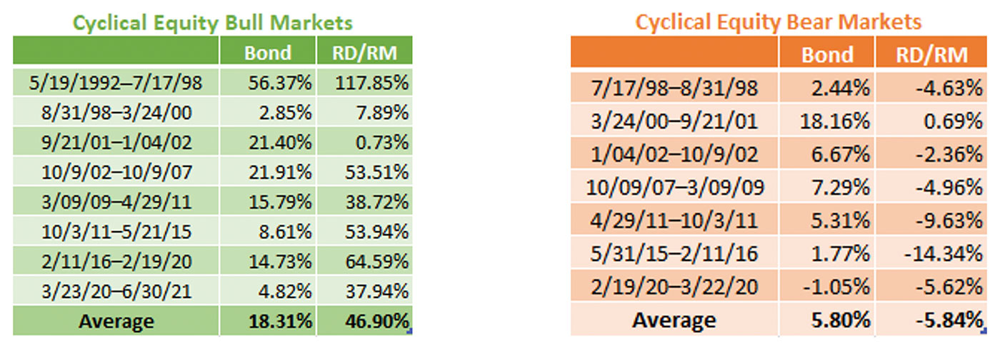
Instead of a mountain chart, a better view is to drill down to the performance of RD/RM during the best and worst of times: cyclical equity bull (rising) and bear (falling) markets.

Note: Bond returns represented by Vanguard Total Bond Market (VBMFX). RD/RM represented by the strategy outlined previously that rotates between a rising-dividend index/ETF and money-market fund.
Source: FastTrack data
Going back more than 29 years, eight cyclical bull markets occurred. RD/RM added significant value during most of those times, which would be expected. The backtesting also identified seven bear markets where the performance of bonds added more value than RD/RM. RD/RM underperformed 17% of the time, or the equivalent of five years out of 29-plus years. The trade-off is having brief periods of underperformance in exchange for a higher annualized return of 8.7% with RD/RM versus 5.2% for bonds.
The bulk of the underperformance occurred during cyclical equity bear markets within a secular bear market (secular bear defined as a lengthy period with little or no price gains) from March 24, 2000, to Oct. 3, 2011. Looking at the full picture during the secular bear, the S&P 500 fell 28%, the bond index rose 102%, and RD/RM gained 81%. RD/RM underperformed bonds but still managed to post gains during one of the worst investment environments for equities.
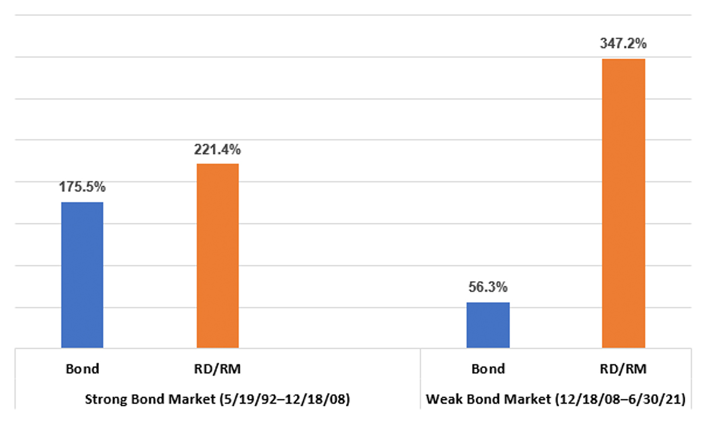
For another perspective, let’s look at how RD/RM performed versus bonds during the best and worst of times for bonds. Bond prices and yields move inversely, therefore the strongest performance periods for bonds occur when yields are at a high point and continue to decline. The weakest period for bonds is when yields are flat to rising.

Source: FastTrack data
During the 16.6-year bond bull market, from May 1992 through December 2008, the yield on the 10-year U.S. Treasury fell from 7.3% to 2.1%. It was the best of times for bonds as yields started high and then declined. Bonds delivered an annualized return of 6.3%, almost matching a 6.7% return for the S&P 500 with dividends. However, RD/RM was able to outperform both with an annualized return of 7.3%.
Over the past 12-plus years, it has been difficult for bonds. Yields have been on the rise, with a recent disruption in that trend due to the pandemic. The 10-year rates started at 2.1% in 2008. Over the past dozen years, they have risen as high as 4.0%, dropping to just 0.5% during the pandemic, with an average yield of 2.3%. RD/RM excelled with a 347% gain compared to a 56% return for bonds.
If you have the temperament, patience, and a time horizon of at least five years, a 60/30/10 allocation, using a rising-dividend risk-management strategy for 30%, could be rewarding and help you reach your investment objectives better than the traditional 60/40 allocation.
The opinions expressed in this article are those of the author and do not necessarily represent the views of Proactive Advisor Magazine. These opinions are presented for educational purposes only.
This article first published in Proactive Advisor Magazine on July 29, 2021, Volume 31, Issue 4.
 Marshall Schield is the chief strategist for STIR Research LLC, a publisher of active allocation indexes and asset class/sector research for financial advisors and institutional investors. Mr. Schield has been an active strategist for four decades and his accomplishments have achieved national recognition from a variety of sources, including Barron's and Lipper Analytical Services. stirresearch.com
