
In Gerald Appel’s 2005 book “Technical Analysis: Power Tools For Active Investors,” he discusses a relative-strength measure of the NASDAQ versus the NYSE Composite. The premise behind the indicator is that the market tends to perform better when the appetite for NASDAQ stocks is greater than the appetite for NYSE stocks. Part of this is due to the higher volatility of the NASDAQ, and part of it is due to investors’ willingness to be more aggressive when investors’ outlook is positive. NASDAQ stocks are seen as more speculative than NYSE stocks, and an outperforming NASDAQ can show an appetite for risk on the part of investors. Whatever the reasons behind it, the indicator has been an excellent barometer over the years.
I began tracking this relative-strength indicator around 2007 or 2008. Since I normally trade the S&P 500 (SPX) and not the NYSE Composite, I tweaked the indicator slightly to use the S&P 500 rather than the NYSE Composite. I found the results of doing this to be even more compelling than when using the NYSE Composite.
The construction of the indicator is simple. It takes just two steps:
- On a weekly closing basis, calculate the ratio of the NASDAQ to the SPX. In other words, simply divide the weekly closing price of the NASDAQ by the weekly closing price of the S&P 500.
- Calculate a 10-week moving average of this ratio. If the current ratio is above the 10-week average, the NASDAQ is leading. If the current ratio is below the 10-week average, the NASDAQ is lagging.
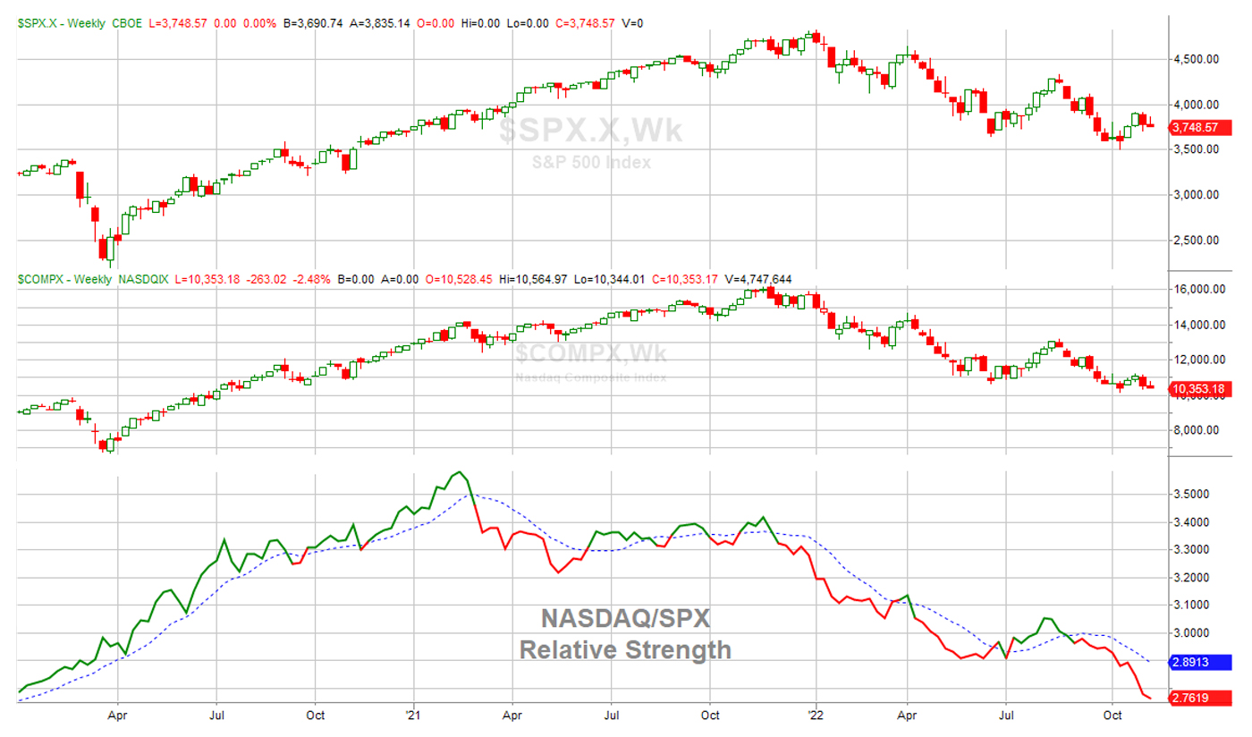
The indicator can be seen at the bottom of Figure 1, along with the S&P 500 Index and the NASDAQ Composite shown separately above it.
FIGURE 1: NASDAQ/SPX RELATIVE-STRENGTH TREND
Source: Quantifiable Edges. Data as of 11/9/2022.
The two lines on the bottom panel represent the relative-strength indicator. When the solid line (current ratio) closes above the dotted line (10-week average), that means the NASDAQ is leading the SPX. When it closes below the dotted line, that means it is lagging the SPX. To make it even easier to view, I’ve made the solid line green when the NASDAQ is leading and red when the NASDAQ is lagging. As you can see, the NASDAQ is currently lagging (as of November 9, 2022).
For much of 2020, the NASDAQ led the S&P 500. In 2021, we saw the indicator flip back and forth. With the long bear market this year, the NASDAQ has spent most of its time in a lagging position.
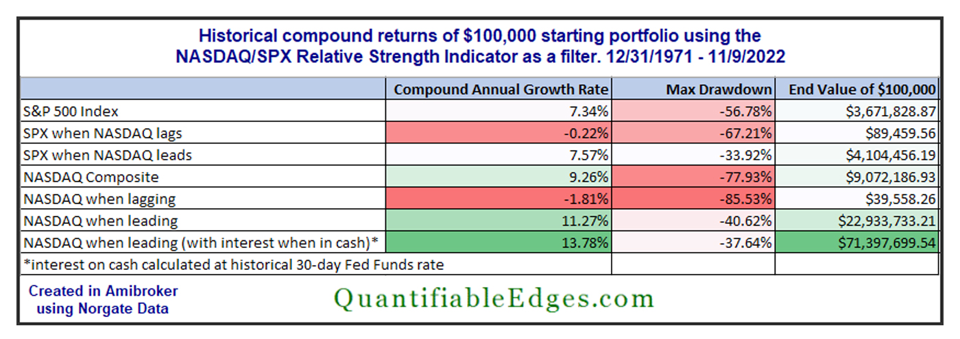
Table 1 shows performance in terms of compound returns of both the S&P 500 and the NASDAQ when the indicator has shown the NASDAQ to be leading or lagging. The “lag” results assume a $100,000 starting portfolio that is only invested when the NASDAQ is lagging. When the NASDAQ is leading, the “lag” models are in cash. The “lead” results assume investment only when the NASDAQ is leading, with cash being held when the NASDAQ is lagging. (Note: No interest on cash is assumed except where noted.)
TABLE 1: COMPARATIVE RETURNS WHEN USING THE NASDAQ/SPX RELATIVE-STRENGTH INDICATOR
Source: Quantifiable Edges. Data as of 11/9/2022.
There is a stark difference in results. Note that the NASDAQ has led the S&P 500 about 56% of the time over the period from December 31, 1971, to November 9, 2022, the time frame measured in Table 1.
The model results show that just being in the market during that 56% of the time (and being flat the other 44% of the time) would have generated more gains than owning the market 100% of the time (buy and hold)—and with less drawdown to boot. This is the case for both the NASDAQ and the S&P 500. With the NASDAQ models showing a compound annual growth rate (CAGR) of 11.27% when leading and a loss of 1.81% when lagging, the divergence there is the most substantial.
This simple NASDAQ/SPX relative-strength indicator has been very effective over a long period of time. Whether you are looking to time the S&P 500 or the NASDAQ, the market has performed dramatically better when the NASDAQ has been leading.
You can learn more about the NASDAQ/NYSE relative-strength indicator in the Quantifiable Edges Market Timing Course. I also note any changes to the indicator in the Quantifiable Edges Subscriber Letter. And it is an input in one of the models I manage at Capital Advisors 360.
As I detailed in a Proactive Advisor Magazine article about four years ago, we have recently entered a very strong seasonal period for the market. But for me to have greater confidence in a potential rally, I would really like to see the NASDAQ take the lead. The results presented in this article should explain why.
The opinions expressed in this article are those of the author and do not necessarily represent the views of Proactive Advisor Magazine. These opinions are presented for educational purposes only.
New this week:
 Rob Hanna has worked in the investment industry since 2001. He is the founder and publisher of Quantifiable Edges, a quant-based website where he also publishes a newsletter. After managing a private investment fund through Hanna Capital Management LLC from 2001 to 2019, Rob joined Capital Advisors 360, where he now serves as a registered investment advisor and focuses on short-term and quantitative strategies. quantifiableedges.com


