


For as long as there have been advance-decline (A-D) data that people have been interested in following, there have been criticisms of that very A-D data for including “the wrong sorts” of issues. Back in 1962, Joe Granville and Richard Russell both pointed to the big divergence between the NYSE A-D Line and the major averages like the Dow Jones Industrial Average (DJIA). That divergence preceded a 27% decline in the DJIA, so in that moment the A-D Line suddenly became much more interesting to a lot of people.
But critics noted then that the NYSE-listed issues contained utilities and insurance company stocks, which were “interest-rate sensitive” and supposedly contaminated the data. The same criticism persists today, but now it is leveled against preferred stocks, bond-related closed-end funds (CEFs), and other issues that trade like stocks on the NYSE. Those other issues make up about 40% of the issues, although they trade only a small fraction of the volume.
Many analysts assert that one should give preference to the A-D numbers for “common stocks,” sometimes referred to as “operating companies only.” This distinction supposedly filters out those damned contaminants. So everyone would be happier and better off if they just followed the “right” sorts of data and ignored those “others.”
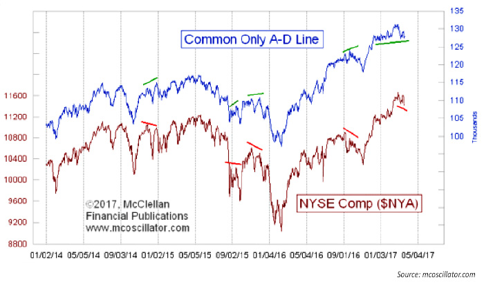
The problem is that the purified A-D data are not always better. The following chart shows that when the common-only A-D Line disagrees with the NYSE Composite Index, it is usually the price index that ends up being right. This is a big problem. The whole reason for hiring an A-D Line to work for you is to give you a different answer from what the price indices are saying. Having an index give you the same message that prices give you is useless. And having data that give you the wrong answer at a pivotal time is worse than useless.
FIGURE 1: COMMON-ONLY ADVANCE-DECLINE LINE VERSUS NYSE COMPOSITE
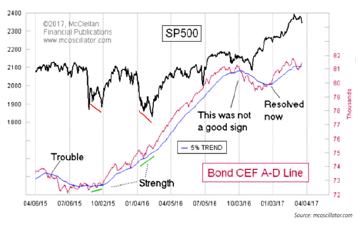
The issues on the NYSE most often blamed for contaminating the A-D data are the bond CEFs. They only make up about 7% of the listed issues, and hardly trade any of the volume, but they are continually trotted out as the “usual suspects” for messing up the A-D data.
This is problematic both from the standpoint of raw prejudice and, more importantly, because it is just not true. These issues tend to be the better canaries in the coal mine, often warning of trouble earlier than the common-only A-D data or other indications.
This next chart shows an A-D Line for the bond CEFs, those supposed contaminants of the A-D data. The point is that this bond CEF A-D Line often tends to be a better indicator of liquidity for the stock market than the data for the actual stocks. This point is counterintuitive, we know, but that is what the data show. So, what are you going to believe: your preconceived notions or the actual data?
FIGURE 2: S&P 500 VERSUS BOND CEF ADVANCE-DECLINE LINE
What about just following the A-D data for the components of a particular index? This one fails the usefulness test as well. Here is a chart of the DJIA compared to an A-D Line made up of only the 30 Dow components.
FIGURE 3: DJIA VERSUS DJIA ADVANCE-DECLINE LINE
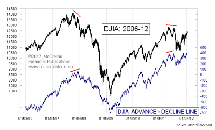
At the left side of the chart, the DJIA topped out on Oct. 9, 2007, but its A-D Line kept making higher highs until Dec. 10, 2007. Not only was there no bearish divergence, but the A-D Line was wrongly saying things were fine as a bear market was starting. And the same thing happened again in 2011, at the right end of the chart.
The whole point of watching advance-decline data is to get a different and better answer about what the future holds. We want to see divergences, especially at price tops, to tell us that trouble is coming. But when the DJIA itself makes a lower high, and its A-D Line makes a higher high, that is a message one is better off not listening to. Instead, one should turn to better “experts” who know what lies ahead.
I once believed, as others still do, that it was better to purify the A-D data, to get the “better” answer. That is why I went to the trouble of writing all of the code (with help from others—thanks, R.N. and crew) to gather and arrange these data in pursuit of those supposedly better answers. But then I tested that hypothesis, and I found it wanting. If one is going to follow the scientific method, a re-evaluation of the hypothesis is required whenever the data do not support one’s hypothesis.
It turns out that the parts of the A-D data that so many people criticize for being “impure” actually seem to have the better answers a lot of the time. It is as though the chaff may be more valuable than the wheat. Think of this next time you hear someone tell you to only use data for the common stocks. That is a prejudiced viewpoint that stems from assumptions rather than examinations, and which the data do not support.
The opinions expressed in this article are those of the author and do not necessarily represent the views of Proactive Advisor Magazine. These opinions are presented for educational purposes only. This article was first published at mcoscillator.com on March 24, 2017.
 Tom McClellan is the editor of The McClellan Market Report newsletter and its companion, Daily Edition. He started that publication in 1995 with his father Sherman McClellan, the co-creator of the McClellan Oscillator, and Tom still has the privilege of working with his father. Tom is a 1982 graduate of West Point, and served 11 years as an Army helicopter pilot before moving to his current career. Tom was named by Timer Digest as the #1 Long-Term Stock Market Timer for both 2011 and 2012. mcoscillator.com