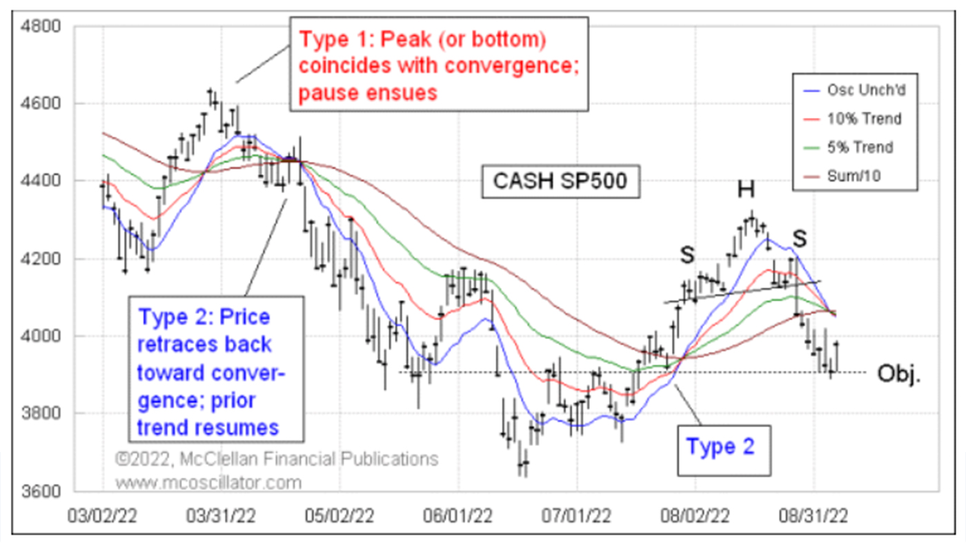

Figure 1 presents a chart I have been watching very closely and sharing in my Daily Edition newsletter. It presents multiple perspectives and has a great lesson on a couple of important chart analysis principles.
FIGURE 1: RECENT ‘HEAD AND SHOULDERS’ STRUCTURE FOR S&P 500

Source: McClellan Financial Publications
The first and more elementary point is that the S&P 500 just recently formed a classic “head and shoulders” (H&S) top structure. An H&S is important not because it is a top (or if inverted, a bottom) but because it provides us with a measuring objective for a price move once the “neckline” breaks.
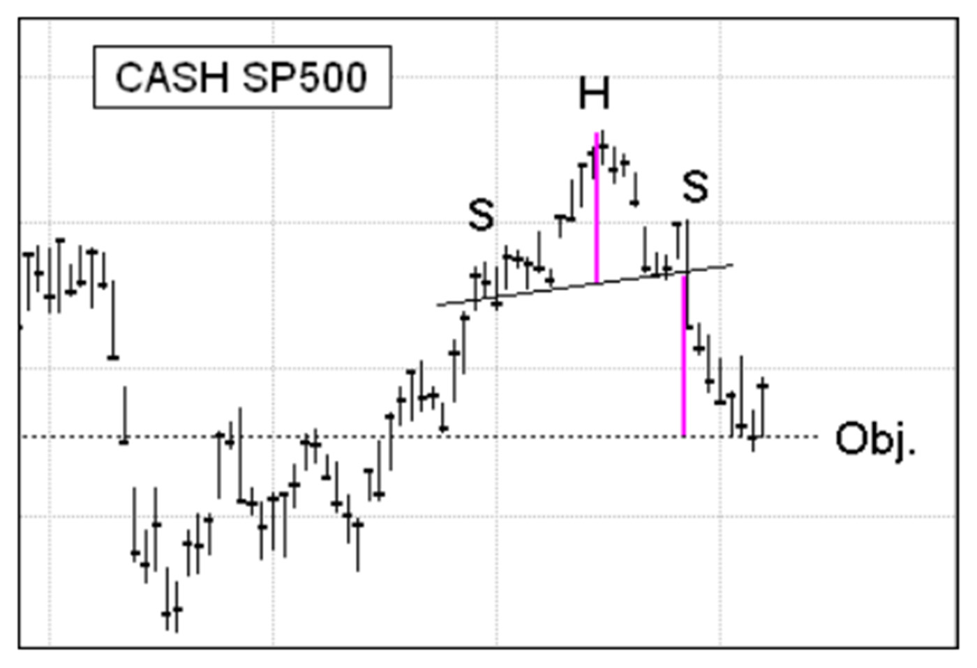
The way this principle works is that you measure the height of the head above the neckline and apply that distance in the opposite direction from the point where the neckline gets broken. That measurement gives the objective for the move. Figure 2 is a diagram that illustrates the principle.
FIGURE 2: ANALYZING A ‘HEAD AND SHOULDERS’ STRUCTURE

Source: McClellan Financial Publications
If the neckline is tilted a little bit, as it is in this example, then the measurement gets just a little bit more complicated, but it is not too hard to do. In this case, the downside objective was around 3,900 on the S&P 500 Index. Reaching an H&S objective does not mean that the move has to stop; it is a target, not a floor. Its purpose is to know where to take profits on a move, if prices get there, which is also not guaranteed. It is not uncommon to see failures in reaching the objective.
In the case of the down move into September 2022, the S&P 500 met that objective pretty precisely and then bounced. It is a fairly impressive example of this principle. And it just so happens that the 3,900 level (which was the H&S objective) has acted as an important support and resistance level more than once in the recent past, making it a great place to have expected support to work again.
While all of this was happening, a “rainbow convergence” of the four moving-average lines in the top chart was forming. Only two of these lines are actual moving averages: the 10% Trend and the 5% Trend. These are exponential moving averages, and the difference between them is the McClellan Price Oscillator. See here for how to calculate the 10% Trend and 5% Trend.
The other two lines are more complicated, but in my view they are worth the trouble to calculate and include on the chart. The Price Oscillator Unchanged (labeled “Osc Unch’d” on the chart) level represents the theoretical price where the Price Oscillator would be exactly unchanged from the day before. It acts like a fast moving average, but it is not one.
The Sum/10 line is a Summation Index of Price Oscillator value, which is then divided by 10 to put it back down into the range where prices are. It, too, acts like a moving average, a slower one, but it is not one. See here for more on these calculations.
A convergence of these four lines is important, but its meaning varies according to how prices are behaving at the moment of the convergence. In a type 1 rainbow convergence event, an accelerated price move serves to pull together the four moving-average-type lines, and the moment of the convergence marks the entry into a pause period. That pause can be just a rest break, or it can be a reversal. Which one it is depends on what prices do, and the mission of the pause is to conduct a test of the Price Oscillator Unchanged line. How that test goes determines what comes next. Seeing prices moving across the Price Oscillator Unchanged line signals a trend change or reversal. Testing and failing to penetrate it is a sign that the trend prior to the pause should resume itself.
In a type 2 rainbow convergence, the price will retrace back toward the price-time point of the impending rainbow convergence, but it will not retrace beyond it. The message of a type 2 convergence is that the trend preceding the retracement should resume itself.
It is pretty clear by now that the Sept. 6, 2022, low was a textbook example of a type 1 rainbow convergence. Prices bottomed on the exact day that the four moving-average-type lines converged. The message of a type 1 is that prices should pause, meaning that the downtrend is on hold for a while. The mission of the pause is to make a test of the blue Price Oscillator Unchanged line, which is still several points above the current price level (as of the writing of this article). So we should expect to see a few days’ worth of pause in the downtrend while that test process gets worked out.
The fun part of this analysis is that we saw the simultaneous completion of a rainbow convergence just as prices pretty much exactly reached the measuring objective of the H&S structure. Things do not always work out so neatly, but it is fun to see these rare examples when two wholly independent charting disciplines come to work together.
The opinions expressed in this article are those of the author and do not necessarily represent the views of Proactive Advisor Magazine. These opinions are presented for educational purposes only.
This is an edited version of an article that first appeared at McClellan Financial Publications on Sept. 8, 2022.
New this week:
 Tom McClellan is the editor of The McClellan Market Report newsletter and its companion, Daily Edition. He started that publication in 1995 with his father Sherman McClellan, the co-creator of the McClellan Oscillator, and Tom still has the privilege of working with his father. Tom is a 1982 graduate of West Point, and served 11 years as an Army helicopter pilot before moving to his current career. Tom was named by Timer Digest as the #1 Long-Term Stock Market Timer for both 2011 and 2012. mcoscillator.com
