
There was once a time when Wall Street’s technicians sat in rooms adorned with paper charts, protractors, and compasses. Back then, buy and sell decisions were made by analysis using Dixon Ticonderoga No. 3 pencils, absent easily adjustable charts and push-button indicators. How times change.
The arrival of more accessible computing power in the 1970s and 1980s marked an evolution in the study of markets via technical analysis. Armed with the ability to produce instantaneous calculations and change parameters with the push of a button, technical indicators proliferated, growing in number and sophistication. Today endless lists of technical studies are available everywhere from free web-based services to online brokerage platforms.
However, the availability of numerous technical studies has limited use for market participants who do not really grasp their underlying meaning.
Indicators are tools, not silver bullets. They tell us something about the internals of the market being studied and must be understood within the context of that market (for example, is it in an uptrend, trading sideways in a range, in a highly volatile period?).
Without truly understanding what an indicator measures or how readings are likely to change under different market conditions, they have extremely limited use.
With all of that in mind, we recommend starting with the basics. So whip out your No. 3 pencil and get ready.
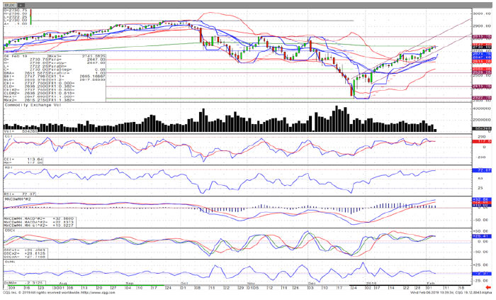
The daily candlestick chart of the S&P 500 Index (SPX) in Figure 1 includes the Commodity Channel Index (CCI), Relative Strength Index (RSI), Moving Average Convergence Divergence (MACD) indicator, and two separate oscillator studies. To confuse matters further, I added the Bollinger Bands, a five-period exponential moving average, and a parabolic indicator.
This chart is chaotic; the many indicators are more likely to cloud one’s analysis than provide useful information. It goes without saying, but I will say it anyway: Avoid this overuse of indicators.
FIGURE 1: CANDLESTICK CHART OF S&P 500 WITH MULTIPLE INDICATORS
Click Chart to Enlarge
Source: optnqueen.com, CQG charting
To play a technical analysis version of “Where’s Waldo?,” try to figure out which indicators displayed on the chart are actually valuable. The answer: the trend, volume, and consistency:
- The trend is up and we are trading in an up channel. Remember, trends tend to persist.
- Volume is declining as the price appreciates. We are losing confirmation and seeing a bearish divergence—perhaps we are becoming overextended?
- Four of the indicators look similar and are pointing in the same direction. Our haphazard attempt to add technical studies left us with four indicators measuring momentum in slightly different ways. We know we are becoming overbought, but we didn’t need to be told that in four languages.
For a further set of simplified “rules” and explanations on technical analysis, please read “Using basic technical analysis to confirm market trends.”
The starting point should always be the trend and support/resistance; these should be understood before indicators are applied.
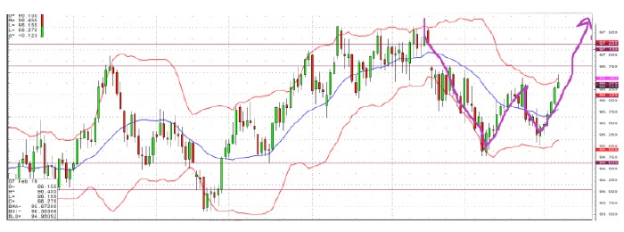
Looking at the daily candlestick chart of the U.S. Dollar Index as of Feb. 7, 2019 (Figure 2), we notice the following technical criteria before any indicators are applied:
- The long-term trend is up.
- The 94.635 low resulted from a breakdown from an ascending triangle.
- There is horizontal support at 94.635.
- The recent low was 94.635. After a failed rally, a higher low of 94.875 was printed and seems to have formed a double bottom.
- Together, this looks like a “W” bottom pattern that becomes activated with a break above 96.375, projecting an upside pattern count to 97.245. The “W” formation is a reversal pattern found after declines or within bases.
There you have it. Without applying any indicators we know the direction of the long-term trend, how to interpret the most recent market action, and what the instrument will likely do.
Can this be wrong? Absolutely. Another value of technical analysis is we can determine the exact price/level at which we are wrong. Trading stop-loss exits and turning points should always be determined before entering a trade.
The hand-drawn purple line indicates what might reasonably be expected at the time of the chart for a continuation of the uptrend.
FIGURE 2: TREND OF U.S. DOLLAR INDEX THROUGH FEB. 7, 2019

Source: optnqueen.com, CQG charting
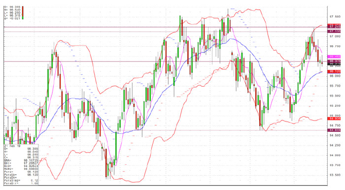
In this case, the resolution of the pattern came on Feb. 20, and the uptrend continuation was less than anticipated (Figure 3). On Feb. 7, the U.S. Dollar Index (DXE) broke above the “neckline” created on Jan. 24. The break above that resistance point was confirmed on subsequent days. At that point, the pattern began completing the measurable up leg of the “W” formation. A break back below 96.375 should give traders pause and would be a reasonable point for a stop-loss exit, if profits had not already been taken.
This represents a real-life example of where basic technical analysis can give investors an edge, identifying entry points for trades and exits.
FIGURE 3: TREND OF U.S. DOLLAR INDEX THROUGH FEB. 20, 2019

Source: optnqueen.com, CQG charting
 Jeanette Schwarz Young, CFP, CMT, CFTe, is the author of the Option Queen Letter, a weekly newsletter issued and published every Sunday, and "The Options Doctor," published by John Wiley & Son in 2007. She was the first director of the CMT program for the CMT Association (formerly Market Technicians Association) and is currently a board member and the vice president of the Americas for the International Federation of Technical Analysts (IFTA). www.optnqueen.com

