
I discussed the Fed’s System Open Market Account (SOMA) and the impact that changes in the SOMA have had on stock market performance over the years in a Proactive Advisor article last August.
The SOMA at the Fed contains all of its bond purchase holdings. In general, when the SOMA has been expanding, that means the Fed is providing stimulus and adding liquidity to the banking system. A declining SOMA means liquidity is being removed from the system. It can be thought of in a similar vein to a rising or falling rate environment. But my research with regards to stock market movement has found that the Fed’s SOMA changes have had a more immediate and measurable impact than changes to interest rates.
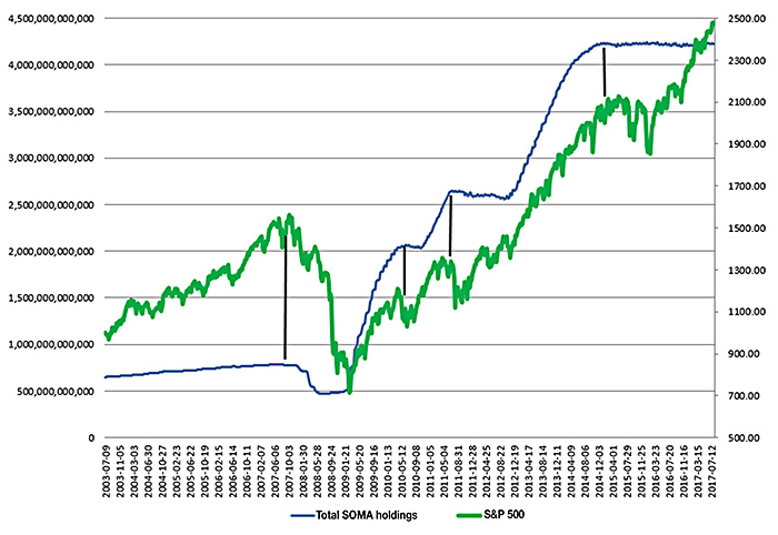
In the previous article, I showed that periods of the Fed’s SOMA expansion, like QE1, QE2, and QE3, saw strong stock market appreciation. And periods of SOMA contraction, like we saw in 2008 and to a lesser degree when QE1 and QE2 ended, have seen the stock market struggle.
FIGURE 1: TOTAL FED SOMA HOLDINGS VS. SPX (7/03–7/17)

Source: quantifiableedges.com
October 2017 saw the beginning of quantitative tightening (QT), which is the common phrase for how the Fed is now reducing reinvestments in maturing Treasury and mortgage-backed securities.
The net effect of this is a contracting SOMA. Over the last several months, QT has intensified. Whereas it started with the Fed’s SOMA reductions of about $10 billion per month, it is now at $30 billion per month and is scheduled to reach as high as $50 billion per month starting in October 2018. I thought it would be interesting to review how the market has performed since QT began with regards to whether the SOMA expanded or contracted during certain weeks. (Note that while QT causes an overall reduction, it is not smooth on a daily or weekly basis. While the SOMA declines most weeks, there are still weeks in which it expands.) Figure 2 breaks it down.
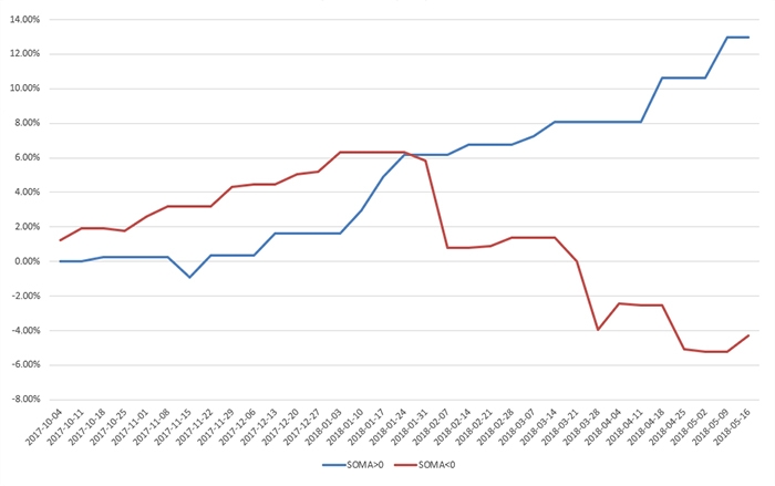
FIGURE 2: SPX PERFORMANCE SINCE QUANTITATIVE TIGHTENING BEGAN
WEEKS OF SOMA INCREASES VS. DECREASES (10/17–5/16/18)

Source: quantifiableedges.com
The blue line assumes you are invested in the SPX during weeks in which the SOMA rose and in cash (not earning interest) during all other weeks. The red line is in cash (no interest) during rising SOMA weeks and then invested in the SPX during down SOMA weeks.
Positive SOMA weeks have shown very strong SPX results, while down SOMA weeks have seen the SPX struggle.
Of course, this is not a surprise to anyone that has observed SOMA and stock market behavior over the last several years. As QT continues to intensify, we could see liquidity issues lead to more volatile corrections than the market has been accustomed to in recent years. While quantitative easing (QE) programs provided a wind at the market’s back, QT is creating a substantial headwind.
As has been the case over the last 15 years, it will be important for investors and traders to monitor Fed action and the Fed’s SOMA changes closely. Readers that are interested in learning more on this topic can check out the free Fed-Based Quantifiable Edges for Stock Market Trading research paper at Quantifiable Edges or visit the NY Fed website, where SOMA balances and changes are reported.
The opinions expressed in this article are those of the author and do not necessarily represent the views of Proactive Advisor Magazine. These opinions are presented for educational purposes only.
 Rob Hanna has worked in the investment industry since 2001. He is the founder and publisher of Quantifiable Edges, a quant-based website where he also publishes a newsletter. After managing a private investment fund through Hanna Capital Management LLC from 2001 to 2019, Rob joined Capital Advisors 360, where he now serves as a registered investment advisor and focuses on short-term and quantitative strategies. quantifiableedges.com
Recent Posts:
