


Liquidity is the big factor which drives the overall stock market. But liquidity is not measurable; it has no units. It is like the wind—you cannot see the wind, you can only see what the wind does to trees, buildings, carports, etc. If you want to know what the wind is doing, you need a windsock. And if you want to know what liquidity is doing, you similarly need an indicator of what liquidity is doing, good or bad.
This week’s chart does a pretty good job at that task. And it comes from an area which several other analysts have maligned, which of course makes it even more fun.
There are some analysts who will tell you that the problem with the NYSE Composite Advance-Decline Line (A-D Line) is that it is contaminated by all sorts of issues that are not really “stocks.” And in part that is true; only about 60% of the NYSE-listed issues are what anyone would agree was a real “common stock,” i.e., an operating company. The other 40% are comprised of preferred stocks, closed-end funds, structured products, and other flavors of investment products that are not really “normal” stocks. And these alternative types of issues are often criticized for messing up the proper stock market data.
And that criticism really makes a lot of rational sense. If you want to know about the real stock market, you ought to look at real stock market data. You should therefore filter out the message from contaminants that are not real stocks. That is how the universe should function. But as with any belief that seems right, and that lots of people believe, sometimes the contrary position is the right one.
Bond-related closed end funds (CEFs) are often cited as the worst of the “interest sensitive” contaminants to the A-D data. Once again, that makes sense. But an evaluation of the actual data shows that these issues somehow seem to know better than “real stocks” what liquidity is doing in the market. It turns out that the bond CEFs, which are supposedly contaminating the NYSE Composite A-D data, appear to know better what the real situation is.
I first started tracking this data back in 2001, thinking, as others do, that if I could somehow purify the A-D data, then I would get better answers. I set up a data-analysis routine that can separate out all the NYSE-listed issues into the category they fall into. But once I ran the data through a centrifuge to separate out the “real stocks” from the supposed contaminants, I found that my hypothesis was wrong—the chaff was worth more than the grain. It turns out that the bond CEF A-D data are actually better than the A-D data for the “real” common stocks. Go figure.
It is a huge pain to do this work on the stock market data, but it turns out to be worth the trouble.
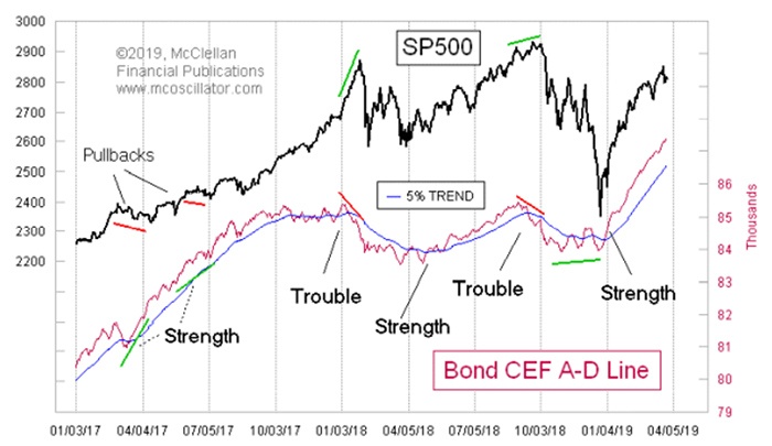
The bond CEF A-D Line shown in Figure 1 is continuing to make new all-time highs, indicating that liquidity is strong enough that even these “least-deserving” issues can still get some of it. If the bond CEF A-D Line can stay above its 5% trend, we have some degree of assurance that the uptrend for stock prices is going to continue. If these least-deserving issues can garner their share of financial market liquidity, then that liquidity must be strong enough to lift the rest of the “real stocks.”
Source: McClellan Financial Publications
The bond CEF A-D Line has arguably done a better job of warning of trouble and upside potential than the real composite NYSE A-D Line. This means that rather being a contaminant, the bond CEF A-D numbers are making the composite data better by their inclusion. Perhaps we should set aside the A-D data on “real” stocks and look at better canaries in the coal mine for answers about how liquidity is doing. For now, the bond CEF A-D Line is making new all-time highs, saying that liquidity is plentiful.
The opinions expressed in this article are those of the author and do not necessarily represent the views of Proactive Advisor Magazine. These opinions are presented for educational purposes only.
A version of this article was first published by McClellan Financial Publications on Mar. 28, 2019.
 Tom McClellan is the editor of The McClellan Market Report newsletter and its companion, Daily Edition. He started that publication in 1995 with his father Sherman McClellan, the co-creator of the McClellan Oscillator, and Tom still has the privilege of working with his father. Tom is a 1982 graduate of West Point, and served 11 years as an Army helicopter pilot before moving to his current career. Tom was named by Timer Digest as the #1 Long-Term Stock Market Timer for both 2011 and 2012. mcoscillator.com