What we’ve learned from 97 years of ‘death crosses’
What we’ve learned from 97 years of ‘death crosses’

The SPX experienced a “death cross” at the market close on April 14. A death cross occurs when the 50-day moving average (MA) crosses below the 200-day MA. It is confirmation of a downtrend. Some people view it as a bearish signal.
As you’ll see, it is not a great “signal.” My Norgate data for SPX goes back to 1928. This includes data from its predecessor, the S&P 90, which was used from 1928 to 1957, when the S&P 500 officially began. That made for an interesting starting point because the first instance, in 1929, came shortly after the market crash that preceded the Great Depression. It was also followed by the most substantial decline—by far.
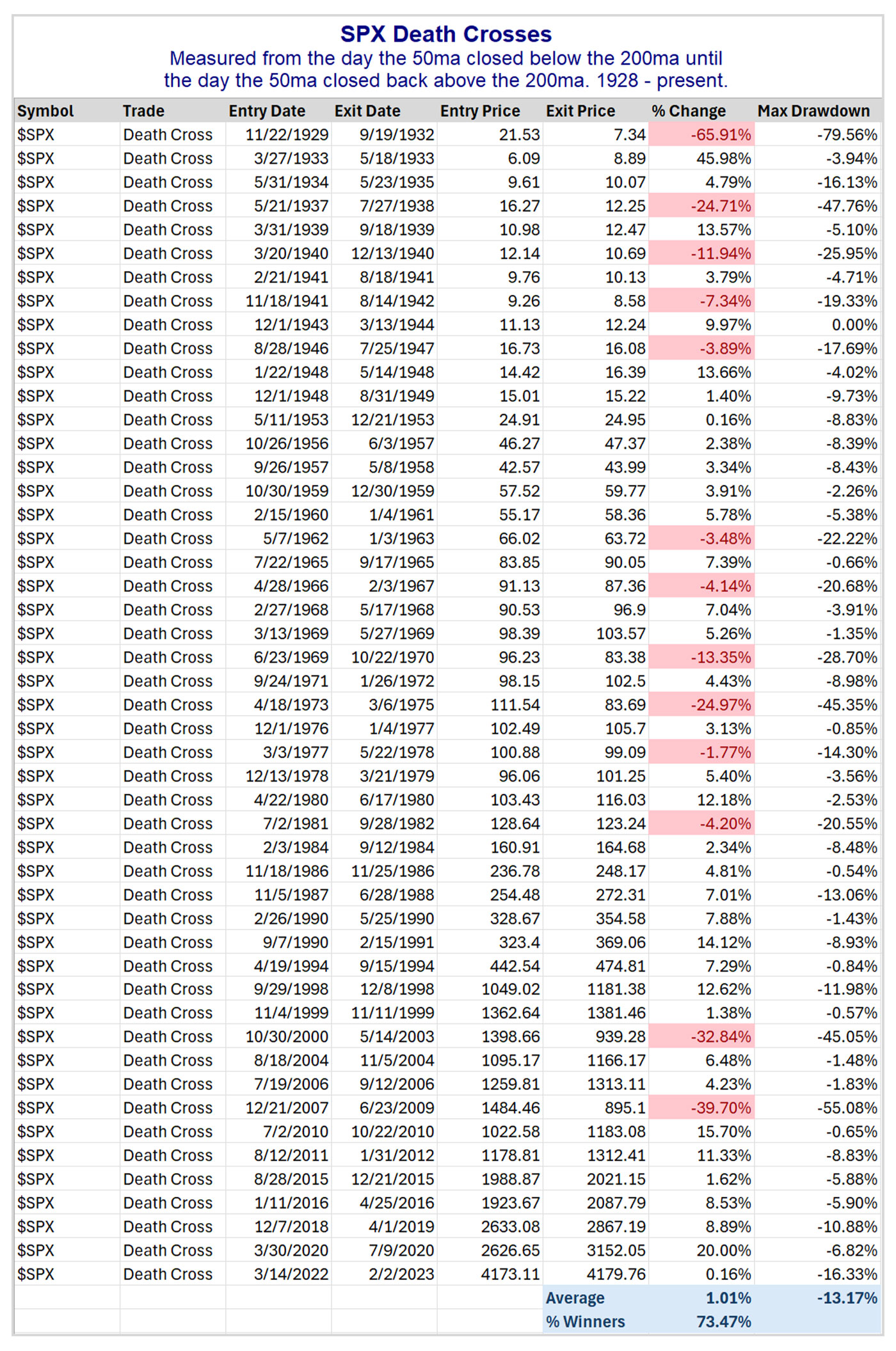
Let’s first look at a list of all the death cross formations and how the SPX performed during those periods (Table 1).
TABLE 1: HISTORY AND PERFORMANCE OF S&P 500 (SPX) DEATH CROSSES

Source: Quantifiable Edges based on Norgate market data
Interestingly, 36 of the 49 instances (73.5%) saw the SPX realize gains while the death cross was in effect. The problem is that the losing trades were very large. And even most of the winners saw a sizable round-trip lower before recovering to post gains (like the last one in 2022). The average drawdown for these 49 trades would have been 13.2%, and there were five separate instances with drawdowns of at least 45%.
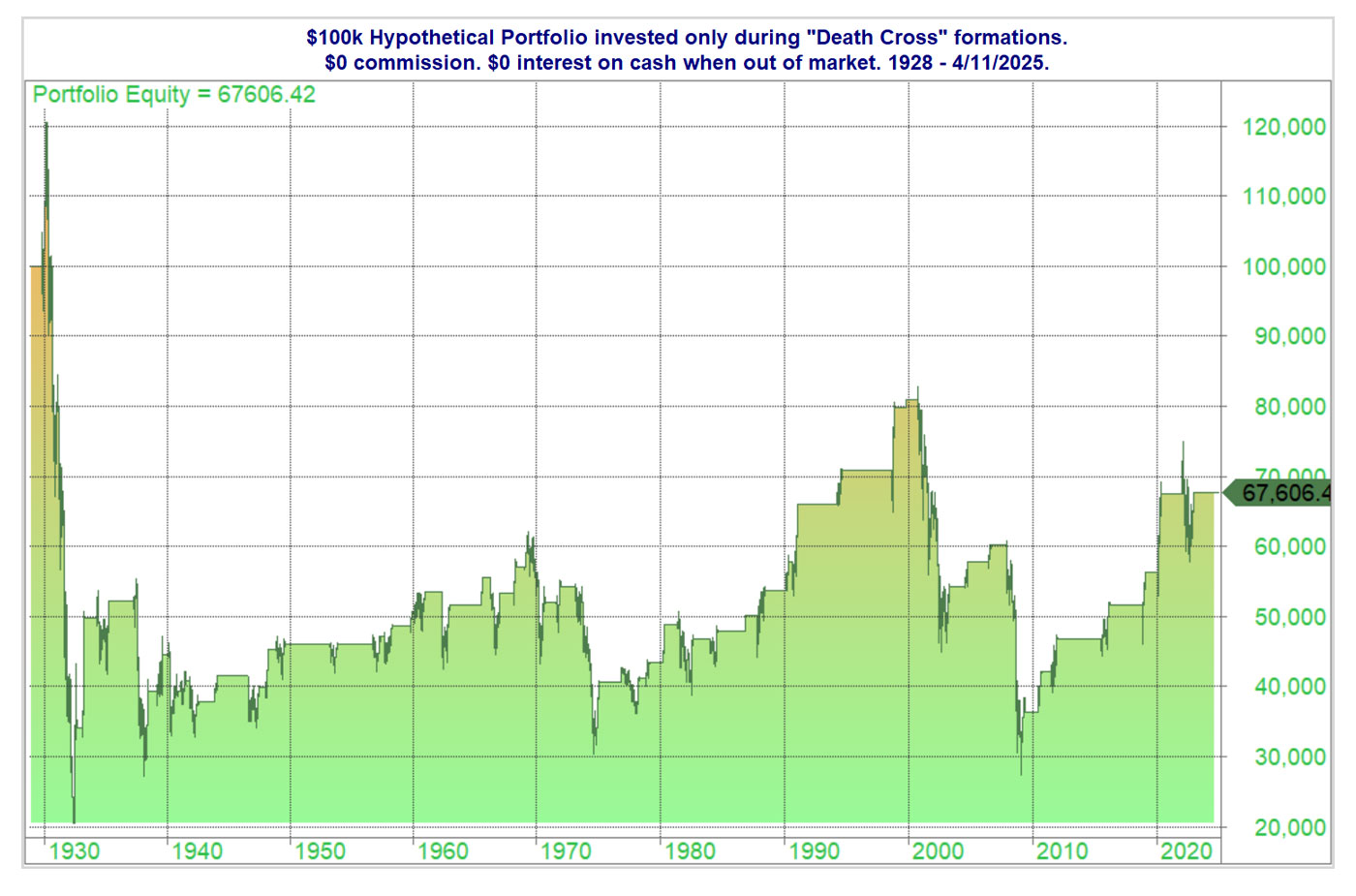
Even though the giant losers were relatively rare, their impact was significant. And the fact that the first instance was the worst one provides a great example of how devastating large drawdowns can be. The profit curve in Figure 1 shows a hypothetical portfolio of $100,000 invested only during SPX death crosses. (A death cross period ends when the 50-day MA crosses back over the 200-day MA, called a golden cross.)
FIGURE 1: INVESTMENT RETURNS DURING DEATH CROSSES (1928–2025)

Source: Quantifiable Edges based on Norgate market data
The first death cross period, from 1929 to 1933, saw the portfolio rise to $120,000 before falling to about $20,000 and then finishing that trade with a value of about $34,000. Overall, the trade has never managed to return to breakeven over 97 years.
However, the 73.5% “win rate” on the death cross tells me it is not a reliable timing device. But the few instances of massive losses show just how valuable it can be to protect gains and avoid large portions of nasty bear markets.
If we enter a big bear market this time, I won’t actually be sitting out of the market for several years. But it does allow us to adjust strategies, exposure, and other risk parameters. On its own, the death cross/golden cross is not a great system. But it can help us put the market into a context where we can better evaluate opportunities. I’ve also found it helpful when combined with other timing indicators, as I’ve done in the Quantifiable Edges Market Timing Course.
This is an edited version of an article that first was published by Quantifiable Edges on April 14, 2025.
The opinions expressed in this article are those of the author and the sources cited and do not necessarily represent the views of Proactive Advisor Magazine. This material is presented for educational purposes only.
 Rob Hanna has worked in the investment industry since 2001. He is the founder and publisher of Quantifiable Edges, a quant-based website where he also publishes a newsletter. After managing a private investment fund through Hanna Capital Management LLC from 2001 to 2019, Rob joined Capital Advisors 360, where he now serves as a registered investment advisor and focuses on short-term and quantitative strategies. quantifiableedges.com
RECENT POSTS


