Interestingly, if they would do just a tiny bit of embroidery modification, they could be assured of making those hats useful. Instead of “Dow 20K,” how about “Debt 20T”? It may be just a fun numerical coincidence that the Dow Jones Industrial Average (DJIA) is approaching 20,000 while the total federal debt is approaching $20 trillion, but there it is anyway.

According to the Treasury Department, the total federal debt as of Jan. 4, 2017, is 19,952,414,234,340.71. If you got lost in all the commas, that’s $19.952 trillion. And in case you struggle as I do at reducing fractional trillions down to more digestible numbers, it is $47.8 billion away from hitting $20 trillion. Heck, we could even see it get there by Inauguration Day, which is only 14 days away. The website US Debt Clock.org has the debt just a hair higher (i.e., $100 million or so—that’s a hair at these levels):

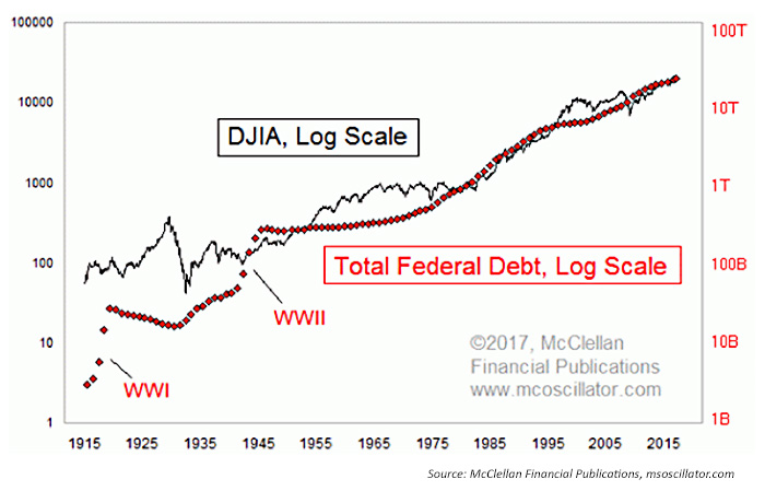
The chart in Figure 1 shows each plot on a logarithmic scaling, and it reveals that the two have been dancing together more than apart. Debt saw a couple of big historical jumps, one for World War I and another for World War II. Otherwise it has been a generally smooth uptrend, roughly in keeping with that of the DJIA. Sometimes the debt is ahead, sometimes the DJIA is.

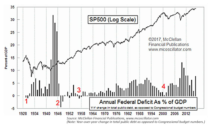
This next chart is one I have shown before, and it reveals that past attempts to pay off the debt, or to even get close to doing so, have been horrible times for the stock market.

Running a budget surplus in 1928 and 1929 helped lead to the Great Depression (red #1 in Figure 3). Attempting to pay off “war bonds” after WWII led to a similar, albeit smaller, slowdown (#2). During Eisenhower’s second term (#3), Congress tried to pay for the big Interstate Highway System bill with appropriate taxation, and a big recession ensued in 1957.
In 2000 (#4), the Clinton administration supposedly ran a budget surplus, although this was fictional since the total federal debt kept increasing every year. Still, the effect of even getting close to a real balanced budget was enough to kill the internet boom and push the U.S. economy into recession.
This highlights a perplexing problem. If anyone thinks that the U.S. ought to pay down its total federal debt, a cause which I incidentally support for the sake of my unborn grandchildren, then he or she had better be ready to accept that this effort will mean a rough time for the stock market, for the wealth effect, the trickle-down wealth effect, and several other economic data series. Paying off debt is unpleasant (duh!). Indeed, it may be too unpleasant for our political leaders to stomach.
If that’s the case, how do we ever pay down the debt, and save our grandchildren from suffering due to our profligacy? That’s the big question. Maybe if we can sell enough Dow 20K hats, or Debt 20T hats, we can profit enough off those sales to put a dent in it.
 Tom McClellan is the editor of The McClellan Market Report newsletter and its companion, Daily Edition. He started that publication in 1995 with his father Sherman McClellan, the co-creator of the McClellan Oscillator, and Tom still has the privilege of working with his father. Tom is a 1982 graduate of West Point, and served 11 years as an Army helicopter pilot before moving to his current career. Tom was named by Timer Digest as the #1 Long-Term Stock Market Timer for both 2011 and 2012. mcoscillator.com
