


The whole media world is abuzz lately with talk about the inverted yield curve and what it means for a potential recession. The track record is mixed there, and there is much debate among academics about whether it is “different this time.”
But there is one very reliable effect associated with fluctuations in the yield curve that we can talk about.
Figure 1 shows the relative-strength ratio for the Russell 2000 Index versus the Russell 1000 (R2/R1). Also in the chart is the spread between the 10-year T-note yield and the 3-month T-bill yield, which is one of the common ways of showing the “yield curve.” The trick in this chart is that the yield spread’s plot is shifted forward by 15 months in order to show how the R2/R1 relative-strength ratio tends to follow in the same footsteps after that lag time.
This is relevant now because the R2/R1 relative-strength line has been moving lower, indicating that small-cap stocks have been underperforming large ones on a relative basis. And the continued drop in the spread between the 10-year T-note and the 3-month T-bill says that this underperformance of small caps is likely to continue for the next 15 months.
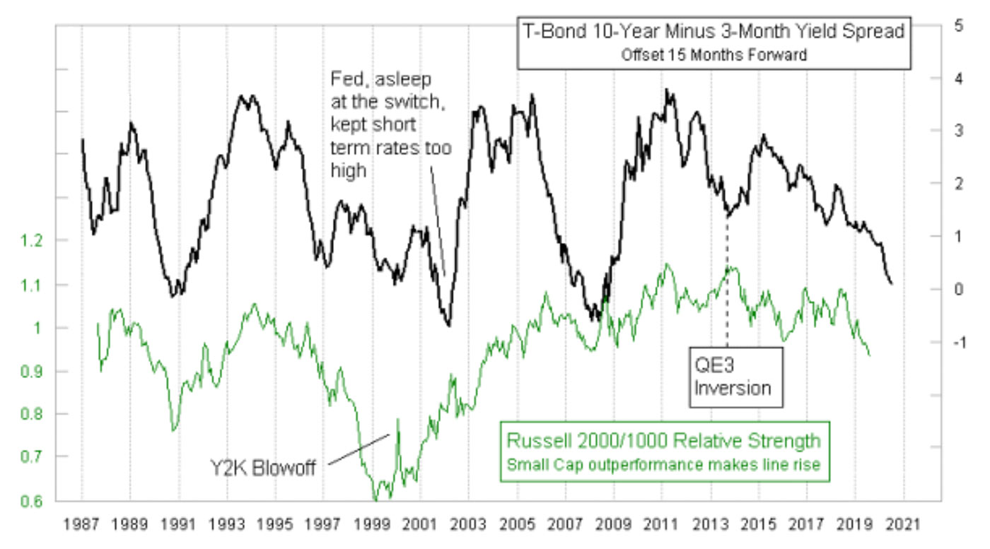
Source: McClellan Financial Publications
This leading indication relationship has not always worked perfectly, and so that is a risk factor for anyone wanting to use it. When the Fed gets really crazy, the relationship goes off track a bit. We saw that with the Y2K spike in small caps, which was fueled by the Fed trying to stuff extra liquidity into the banking system just in case anything went wrong with all of the computers in the world.
We also saw that when the Fed started the QE3 program, with massive injections of liquidity into the banking system, they were able to ward off what should have been a dip in small-cap relative strength. Once QE3 started winding down in late 2014, the relationship got back to normal.
So it is reasonable to question now whether the Fed’s current restrictive stance on interest rates is going to skew this relationship again. I’ll have a definitive answer to that question in about 15 months.
Another relationship that is part of this dynamic is worth mentioning. The relative performance of small caps versus large caps is also related to the movements of the price of gold, or at least that is the case most of the time.
The two plots in Figure 2 are well-correlated over the really long term, going back as far as there is price data on the Russell 2000 and Russell 1000. At shorter-term time scales, though, we do see disagreements with them, and that can be instructive.
Right now, gold prices are zooming up to the highest level since 2013, and the R2/R1 relative-strength ratio disagrees strongly with that action in gold prices. So who is right?
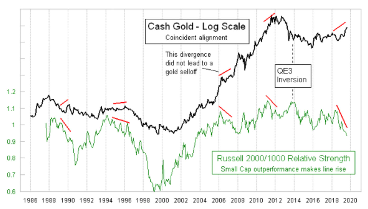
Source: McClellan Financial Publications
Most of the time, when there is a divergence like this, the R2/R1 relative-strength ratio ends up being right about where both are headed. So that would mean gold is going ridiculously off track here by rallying up above $1,500. But in 2008, gold shrugged off a similar divergence and kept moving higher (for some time). So while the normal reaction is for this sort of divergence to be bearish for gold, the rule is not without exceptions. Still, the better bet based on history is to expect gold to wake up and realize that it is climbing up on its own, and without support from the R2/R1 relative-strength line or what the spread between the 10-year T-note and the 3-month T-bill says should be happening.
That is a problem for the gold bulls.
The opinions expressed in this article are those of the author and do not necessarily represent the views of Proactive Advisor Magazine. These opinions are presented for educational purposes only.
A version of this article was first published by McClellan Financial Publications on Aug. 22, 2019.
 Tom McClellan is the editor of The McClellan Market Report newsletter and its companion, Daily Edition. He started that publication in 1995 with his father Sherman McClellan, the co-creator of the McClellan Oscillator, and Tom still has the privilege of working with his father. Tom is a 1982 graduate of West Point, and served 11 years as an Army helicopter pilot before moving to his current career. Tom was named by Timer Digest as the #1 Long-Term Stock Market Timer for both 2011 and 2012. mcoscillator.com