


The price of gold carries on an interesting relationship with the exchange rate of the Japanese yen versus the dollar. Most of the time, the two move together, but they occasionally disagree. When that happens, it is usually the chart plot of the yen that ends up being “right” about where both are headed.
That is relevant at the moment because the dollar price of gold is making lower highs and lower lows, but the yen is showing a bullish divergence. The yen is not yet making higher highs, but it is making at least a higher low, and that is different from what the price of gold is doing (Figure 1).
FIGURE 1: JAPANESE YEN VS. GOLD FUTURES
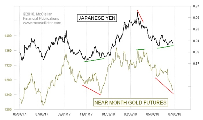
Source: McClellan Financial Publications
Technical analysts speak of pattern “correlation,” which is an inherently loose term. Data series that correlate with each other are thought of as doing generally the same thing. But with time-series data, correlations can be hard to quantify.
Many analysts turn to Pearson’s Correlation Coefficient as a means of applying a numerical rating to show how well two sets of data are correlated. Developed by statistician Karl Pearson, this statistical methodology is great for analyzing the relationship of properties among members of a population group. For example, if you wanted to see how well people’s height and weight are correlated (hint: really a lot), then Pearson’s Correlation Coefficient is a great way to quantify that.
It loses effectiveness, however, when people apply it to time-series data. The reason is that a trending move in a time series can throw off the calculations and make an uncorrelated pair of data sets seem to be well-correlated.
I discussed this point back in 2010 in an article titled “Correlations May Not Be What They Seem,” featuring the following two charts to make the point about how Pearson’s Correlation Coefficients can mislead.
FIGURE 2: PEARSON’S CORRELATION COEFFICIENTS CAN MISLEAD
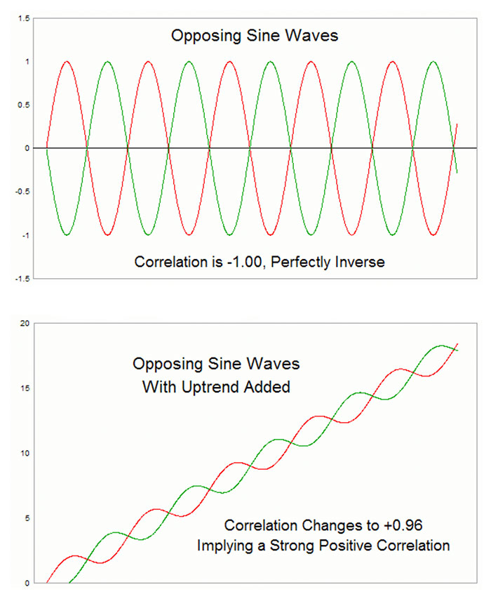
Source: McClellan Financial Publications
Just adding an uptrend to obviously inversely correlated data changes the correlation coefficient from perfectly negative to almost perfectly positive. This is why Pearson’s Correlation Coefficient is the wrong tool for quantifying the correlation between two sets of time-series data. Other statistical tools do that task better, but they are computationally much more complicated. And people get used to calling up a Pearson’s number easily in a spreadsheet or other programs, so they go with what is easy because it gets them a number, rather than doing the harder work to get something that is right.
Now, having said all of that, I am going to go back on my own point to note that in a very limited circumstance, Pearson’s can still be useful sometimes. The key is to look at it over a short enough time frame to allow its weaknesses to become a strength. I have found that 10 trading days is a useful look-back period for this purpose.
I previously examined a 10-day correlation coefficient between the VIX Index and the S&P 500, finding that the rare instances of a positive number marked telling turning points for stock prices. Usually those negative correlation readings mark price tops for the S&P 500.
The same technique can be used for the Japanese yen and the price of gold, as shown in Figure 3.
FIGURE 3: 10-DAY CORRELATION OF GOLD TO YEN
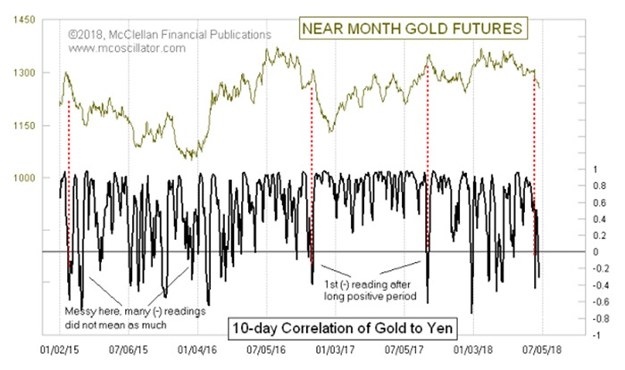
Source: McClellan Financial Publications
Usually the yen and gold are in positive correlation with each other, and so most of the time this indicator is above zero, as it should be. When it goes below zero, it can sometimes have important information to convey, especially if it is the first such voyage below zero in a long time.
On June 14, as gold was making a little spike top before dropping sharply, this indicator went negative to -0.45, and thus marked that minor top. But now it is back negative again as the yen is making a bullish divergence and disagreeing with the lower low that gold prices are making.
Using such a short look-back period avoids the inherent problem of having a trending move in either or both data series create an artificially high correlation coefficient. What it does instead is tune in to those rare episodes when the yen and gold are doing opposite actions over a short period, which is more typically associated with signaling a turning point. As noted above, those signals usually mark price tops for gold, but in this current case, it seems more likely to be a message of a gold price bottom.
The opinions expressed in this article are those of the author and do not necessarily represent the views of Proactive Advisor Magazine. These opinions are presented for educational purposes only.
This article was first published by McClellan Financial Publications on June 29, 2018, at https://www.mcoscillator.com/.
 Tom McClellan is the editor of The McClellan Market Report newsletter and its companion, Daily Edition. He started that publication in 1995 with his father Sherman McClellan, the co-creator of the McClellan Oscillator, and Tom still has the privilege of working with his father. Tom is a 1982 graduate of West Point, and served 11 years as an Army helicopter pilot before moving to his current career. Tom was named by Timer Digest as the #1 Long-Term Stock Market Timer for both 2011 and 2012. mcoscillator.com
Recent Posts: