


There is a lot of talk lately about this bull market “going parabolic.” Most of the time when that term is used, people are thinking about prices swooping upward like the main cable on a suspension bridge, with each additional lateral increment seeing increasing vertical increments.
But a parabola can also be seen in the path of a bouncing ball, which goes up the fastest at first and then stalls out at the apex of its rise. If you turn a plot of a bouncing ball upside down, you’ll get a pattern resembling a suspension bridge. Parabolas are the same, even if turned upside down.
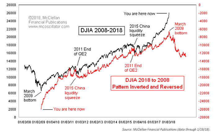
That’s the point behind the following chart example that I developed on January 18, 2018—just because it occurred to me that this bull market’s pattern of the Dow Jones Industrial Average (DJIA) looked like it was repeating itself now, but upside down and backward.
DOW JONES INDUSTRIAL AVERAGE (DJIA): 2008–2018
It has long been rumored that if you play certain Beatles songs backward, a technique known as “backmasking,” you can hear secret messages, including the revelation that “Paul is dead” (he’s not, by the way, last I checked). This led to the joke that if you play a country music song backward, your ex will come back to you, your truck will start running again, and your dog will come back to life.
When I was a kid, I took violin lessons. My teacher, Mr. Conway, had me play a Beethoven duet with him that was a musical joke. The single sheet of music was placed on a table between the two violinists. Each musician reads the music from what they see as the top of the sheet. They end up at the bottom—the other guy’s top—but with the notes in the score upside down. Beethoven could make that work musically. In the chart, I pay homage to Beethoven by playing the DJIA’s bull market song backward.
If you look closely, you can see lots of moments of coincidence in the minor price patterns, which makes this comparison interesting. There are also a few instances of pattern inversion, which is pretty normal in any analog comparison. By this way of looking at the DJIA’s pattern, the current blow off upward in prices is the echo of the up move out of the 2009 bottom. That up move ended when QE1 (quantitative easing) was shut down, and it led to the “flash crash” of 2010. The implication is that the 2015–2016 correction was the corollary to the flash crash, and now we are playing back the bull market rally out of the 2009 bottom.
This is admittedly an irregular way of portraying a price analog, and full of peril in drawing conclusions about what we see continuing. But it is still a fun chart. I do not have evidence that this is a legitimate form of chart analysis. It just seems to be working at the moment. And as I reveal it now to the world, I remind myself of my #1 rule of technical analysis: “A phenomenon will remain in effect only until noticed.” The bulls had better hope that rule works this time.
The opinions expressed in this article are those of the author and do not necessarily represent the views of Proactive Advisor Magazine. These opinions are presented for educational purposes only.
This article was first published by McClellan Financial Publications on January 18, 2018.
 Tom McClellan is the editor of The McClellan Market Report newsletter and its companion, Daily Edition. He started that publication in 1995 with his father Sherman McClellan, the co-creator of the McClellan Oscillator, and Tom still has the privilege of working with his father. Tom is a 1982 graduate of West Point, and served 11 years as an Army helicopter pilot before moving to his current career. Tom was named by Timer Digest as the #1 Long-Term Stock Market Timer for both 2011 and 2012. mcoscillator.com