


Wow! Many things have happened since I last wrote an article for Proactive Advisor Magazine—and that was just a few months ago.
This includes epic fires, earthquakes, volcanic eruptions, winter storms, increased UFO sightings, a giant plague of locusts, the COVID-19 coronavirus, a volatile stock market, and the most unbelievable event of all—some of the largest platforms offering investors “no commission trades.”
If all of this doesn’t end up triggering the onset of Armageddon, tactical investors (and strategists) now have more flexibility to manage portfolios with lower trading costs. (Of course, trading and transaction costs and fees depend on many factors, including investment vehicles, type/size of account, and the platform being used.)
I recently dug up a bunch of my old models that I had deserted years ago because of the impact of high trading costs. Many of them were “end of week” analyses, but most were “end of day.” Once I brought them up to date, I was happy to learn they behaved well through the years I had put them aside.
One of my “dig ups” is a model that specifically tracks relative weakness. Yep, relative weakness.
It is the flipside of relative strength. It looks at a group of ticker symbols and the comparative rolling drawdown relative to a target ticker. It works surprisingly well—with many tickers in various time frames. In the following example, my goal is to protect “Portfolio X” in nasty times and catch the trend in good times.
I strongly suggest using investment vehicles that exhibit varying degrees of historical volatility and correlation to a target ticker.
In this example, I am picking the S&P 500 (SPY) as my target ticker. Next, I included seven ETF tickers to compare to SPY. The first is industrials (XLI) because of strong, consistent correlation and volatility relative to SPY. Next are technology (XLK) and consumer discretionary (XLY) because of slightly higher volatility and drifting (albeit almost always positive) correlation to SPY.
Next are the defensive consumer staples sector ETF (XLP) and health care (XLV) due to their consistently lower volatility yet correlated behavior to SPY. Next, is utilities (XLU), which is a wildcard for both volatility and correlation to SPY. Finally, I add the 1X inverse S&P 500 (SH), which has equal volatility to SPY and inverse correlation.
Here is the universe of ETFs I am comparing to SPY in this example: XLI, XLK, XLY, XLP, XLV, XLU, and SH. When I’m charting, I tend to toggle between 12 months, 12 weeks, or 12 days when I want to get an idea of how various indicators are behaving in current markets across different time frames. I decided to do a rolling 12-week analysis of drawdown on closing prices. Historically, a lot of stuff has hit the fan within a 12-week period, and I have found it to be a very relevant time frame.
The methodology is simple. At the end of each week, track the current closing price versus the highest closing price for the past 12 weeks for each ticker. If the closing price of any ticker is the high for the past 12 weeks, then the drawdown is 0%.
Then, equally allocate to those tickers whose drawdowns are less than or equal to the drawdown of the target ticker. In strong, bullish markets, tickers such as XLK, XLI, and XLY will likely capture most of the weekly allocations until conditions change.
In choppier, downtrending markets, a shift to XLU, XLP, and XLV will likely capture the weekly allocations. Finally, in very poor markets, SH, XLP, and XLU will capture most of the weekly allocations until conditions change.
I ran the study from June 23, 2006, (when SH was introduced to the market) to Feb. 21, 2020. The results? The S&P 500 (SPY) returned 231.2%, its largest drawdown was 54.6%, and it had a 2.4% weekly standard deviation.
The results for “Portfolio X” (changing ETF allocations)? It posted a 299.8% return, its largest drawdown was 22.4%, and it had a 1.5% weekly standard deviation—a 129% greater return than SPY with 59% less drawdown and 63% of the volatility. Hmm …
Relative weakness should be used as a component of a total analysis package, but it is certainly an impressive indicator on its own.
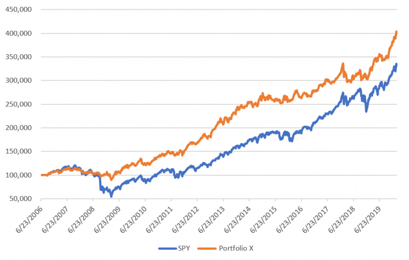
Source: Ian Naismith, kensingtonanalytics.com
FIGURE 2: ROLLING DRAWDOWN ANALYSIS OF ‘PORTFOLIO X’ AND SPY
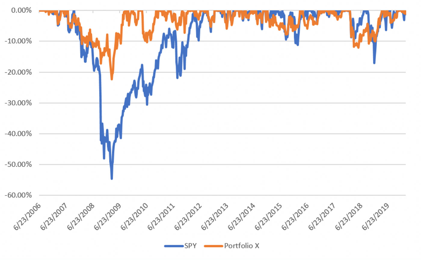
Source: Ian Naismith, kensingtonanalytics.com
 Ian Naismith is a partner and the index designer of Smooth Sailing Indexes Inc., which is a leader in tactical “risk-on/risk-off” index development. Mr. Naismith has been analyzing and trading the markets since the early 1990s. He is a member of the National Association of Active Investment Managers (NAAIM) and has also served as board member and president. www.smoothsailingindexes.com