

Thanks greatly to our friend, Tom McClellan (known for his work with the McClellan Oscillator, first developed by his father, Sherman McClellan), we were able to conduct some studies from historic NYSE new high/new low data. You will see that cumulative new highs minus new lows is not keeping pace with $SPX new all-time highs, revealing a market divergence that has spelled trouble in the past.
We looked at the long-term picture of this data, going back to 1979. The cumulative line advances along with the stock market. This shows that the two are correlated—that as the market is advancing and making new market highs, so is the cumulative line.
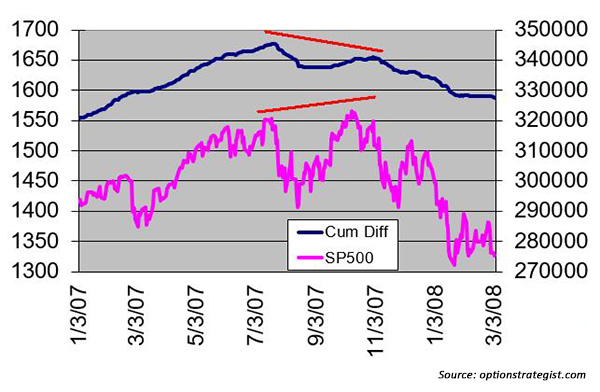
Figure 1 shows the top in 2007. On this chart and the following charts, the upper (blue) line is the cumulative total of new highs minus new lows. The lower (pink) line is $SPX. $SPX made a new high in July 2007 and then, after a correction, moved to a new all-time high in October 2007. There is a rising red line above the $SPX chart in Figure 1 to denote this. Meanwhile, cumulative net new highs did not make a new high. The red line over that chart declined. This was a negative divergence and warning of a market decline. As we know, the market declined sharply after that.
FIGURE 1: CUMULATIVE NET NEW HIGHS VS. S&P 500, PRIOR TO CREDIT CRISIS
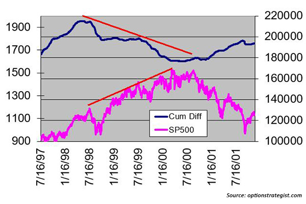
The market top in 2001 is shown in Figure 2. It shows a very long-term divergence between net new highs and $SPX. We saw this same sort of thing when we analyzed cumulative breadth: sometimes the divergence can last for a long period of time. In Figure 2, the divergence began in 1998, which many observers at the time (and even historians today) say was the “real” top of the market, and lasted until the market finally peaked in 2000. The red lines show the long-term divergence that took place. What you might also want to note is that, after $SPX peaked in 2000 and began to fall in 2001, the net new highs line advanced. This happens with some frequency. It seems very unusual, and I don’t have a ready explanation for it, but it doesn’t change the fact that the negative divergence eventually spelled trouble for stocks.
FIGURE 2: CUMULATIVE NET NEW HIGHS VS. S&P 500, PRIOR TO ‘DOT-COM’ CRASH
That brings us to the present. Figure 3 shows the current state of the cumulative net new highs versus $SPX.
FIGURE 3: CUMULATIVE NET NEW HIGHS VS. S&P 500, CURRENT MARKET
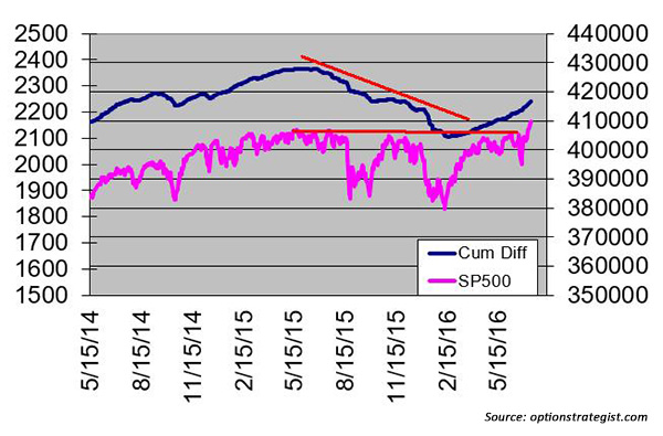
The cumulative net-new-highs line peaked in the summer of 2015, and, while it has been rising this year, it is still well below its 2015 peak. Meanwhile, we know that $SPX is at new all-time highs. As a result, a negative divergence is in place.
For now, we do nothing with this information except note it and remember it, because all of our other indicators are currently on buy signals. The way I prefer to interpret these longer-term divergences is that when they exist, you do not sell the market immediately. But sell signals should not be ignored: When the next major sell signal occurs, remember this analysis and the painful lessons from the major market downturns of the past 15 years.
 Professional trader Lawrence G. McMillan is perhaps best known as the author of “Options as a Strategic Investment,” the best-selling work on stock and index options strategies, which has sold over 350,000 copies. An active trader of his own account, he also manages option-oriented accounts for clients. As president of McMillan Analysis Corporation, he edits and does research for the firm’s newsletter publications. optionstrategist.com