

Anotable bit of action that occurred on August 28, 2015, was that the 50-day moving average (50ma) of the SPX closed below its 200-day moving average (200ma). This is often referred to as a “Death Cross.” (When the 50ma is above the 200ma, it is a “Golden Cross.”) This is the first Death Cross since the Golden Cross emerged at the end of January 2012. Let’s take a brief look at Death Crosses for SPX and see if they have lived up to their name.
I looked back to 1960 to see how the SPX fared during past Death Crosses. To measure the results, I examined performance from the time the 50-day moving average fell below the 200-day until it rose back above it. There have been 28 Death Crosses over this time period.
Interestingly, 20 of the 28 instances (71%) actually saw the SPX realize gains while the Death Cross was in effect. The problem is the losing trades were very large. And even most of the winners saw a sizable round trip lower before they were able to carve out some gains. The average drawdown for these 28 trades would have been 11.8%. And the biggest drawdown would have been 54.8%.
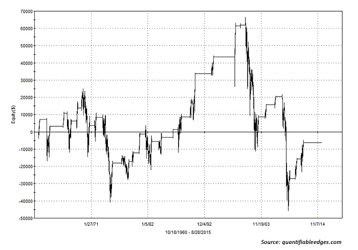
Of course, the worst bear markets saw the Death Cross followed by substantial market losses. The largest of these was the 2007-2009 bear market, in which the S&P 500 netted a 39.7% loss. And other big bears, like those in 1973–1975 and 2000–2003 also saw extremely large declines. The impact of these giant losers can be seen by examining a compounded profit curve. The curve in the following chart is for a $100,000 hypothetical starting portfolio.
As you can see, the net result since 1960 would have been a loss of 6.35% to the hypothetical portfolio. (This curve assumes no interest while out of the market, and no other expenses.) So most of the time the Death Cross turns out to mark nothing more than a moderate market correction. And long-term traders would be better off riding out that correction than jumping in and out based on Death Cross or Golden Cross formations. But there is the risk that any correction could turn into a nasty bear.
And if a nasty bear did arrive, long-term investors would get slammed. It does not take many big bear markets to ruin the long-term profit curve. So while not a reliable timing device, it is notable that the market has failed to generate long-term profits under the Death Cross.
In looking at other indexes, like the NASDAQ and the Dow Industrials, similar stories would have been told. Most instances saw net gains during Death Cross formations, but the occasional big loser would wipe out large portions of previous gains.
So does the Death Cross deserve such an ominous name? Probably not. But traders that are concerned with preserving capital could utilize Death Cross signals to possibly avoid the most significant declines of nasty bear markets.
SPX PERFORMANCE FOLLOWING ‘DEATH CROSS’
(Periods when 50-day moving average falls below 200-day until 50-day crosses back above 200-day)
October 1960–August 28, 2015
The opinions expressed in this article are those of the author and do not necessarily represent the views of Proactive Advisor Magazine. These opinions are presented for educational purposes only.
 Rob Hanna has worked in the investment industry since 2001. He is the founder and publisher of Quantifiable Edges, a quant-based website where he also publishes a newsletter. After managing a private investment fund through Hanna Capital Management LLC from 2001 to 2019, Rob joined Capital Advisors 360, where he now serves as a registered investment advisor and focuses on short-term and quantitative strategies. quantifiableedges.com