


Editor’s note: As can be seen in the following chart, the 50-day simple moving average (SMA) for the S&P 500 (SPX) has consistently stayed above the 200-day SMA since early 2016, though daily price action for the SPX has tested the 200-day SMA several times. Inevitably, a crossover of the two averages, commonly called the “death cross,” will happen again. Does this indicator provide an edge to investors? Contributor Ian Naismith examined this issue for Proactive Advisor Magazine in December 2015. His analysis is presented here.
S&P 500 (SPX) WITH 50-DAY AND 200-DAY SIMPLE MOVING AVERAGES
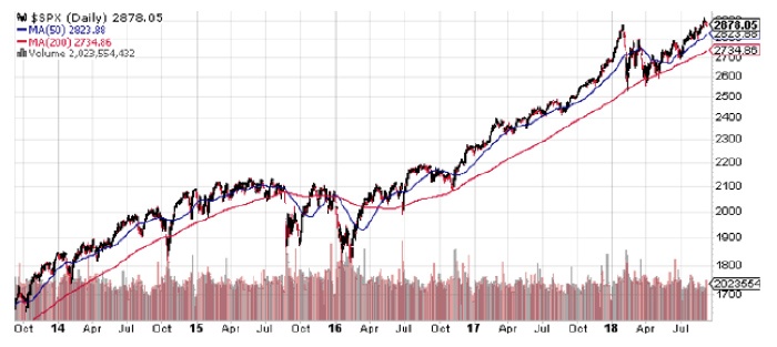
Source: StockCharts.com, data through 9/6/18.
Well, it finally happened in 2015—the death cross occurred across the “four horsemen.” Yep, that ominous event when the 50-day simple moving average crosses below the 200-day moving average—the event that sends chills down the spine of most bulls. First, it was the Dow 30 on July 22. Then, the Russell 2000 on August 18. Then, the S&P 500 index on August 28. And finally, on September 4, it happened to the NASDAQ 100. The onset of Armageddon was in place right in time for the arrival of Halloween.
S&P 500: 50/200 CROSS COMPARISON TO BUY & HOLD 12/19/89–11/11/15
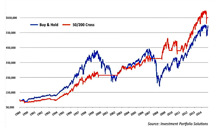
If you were to have traded based only on the 50/200 death cross and its opposite event —the golden cross—then your 2015 results through early November would have ranged from -1.3% to -4.9%, depending on the index. Sure, if the indexes had continued to decline into the abyss, these would have been acceptable numbers. The reality is the death cross news flooded the airwaves as markets were beginning their retreat down. Talking heads on the tube and at financial conferences made reference to the market decline signaled by the death cross, exuding a sense of confidence as if it is a “sure thing” indicator.
So, let’s take a closer look across the landscape of death crosses over time (I’ll choose the S&P 500 and no dividends). If you had put $1 into the S&P 500 at the end of 1960, you would have $35.92 by 2015. If you had put in $1 and traded 28 times over the past 54 years—buying with the golden cross and exiting to cash with the death cross—you would have $39.01, with 82% winning trades. Not a huge difference over buy-and-hold during that time frame, for sure.
However, the value of exiting at the death cross is the reduction of portfolio destruction. There is only one time when the drawdown was deeper than 20% using a death cross “exit plan.” (It started on that infamous day in 1987, which was down more than 20%.) But, the buy-and-hold investor has had to endure nine major drawdown events below -20% before markets climbed up to make another new high—with five of those events below -30%, two below -40%, and one below -50%. No one wants to tolerate that kind of pain. Therefore, paying attention to golden-cross and death-cross macro events should be considered “bypass deep drawdown insurance.” The cost of insurance is the latency of entering after the golden cross.
Looking deeper into various death crosses, here are the results for the past 54 years. Doing a quick analysis of every combination of moving-average crosses with a minimum of five days and a maximum of 200 days, the most-used death cross of 50/200 is ranked #6 for the past 54 years. The 60/190 is ranked #1, with $1 growing to $46 and a -31% max drawdown and 79% accuracy.
However, since the market low of March 2009, the 60/190 is ranked #138 of 1,560 possibilities and 50/200 is #317, but 10/5 (inverse golden/death cross?) has been by far the best-performing trading cross. Yes—the 10-day moving average crossing above and below the 5-day. And, the 45/25 cross has been correct 96% of the time in 22 trades!
This goes to show, like any other indicator, different time cycles call for different iterations. The extremely hard part is detecting and benefiting from those changes in time.
The opinions expressed in this article are those of the author and do not necessarily represent the views of Proactive Advisor Magazine. These opinions are presented for educational purposes only.
This article first published in Proactive Advisor Magazine on December 10, 2015, Volume 8, Issue 10. Some content has been updated to reflect current data.
 Ian Naismith is a partner and the index designer of Smooth Sailing Indexes Inc., which is a leader in tactical “risk-on/risk-off” index development. Mr. Naismith has been analyzing and trading the markets since the early 1990s. He is a member of the National Association of Active Investment Managers (NAAIM) and has also served as board member and president. www.smoothsailingindexes.com