Using asset flows to help find and manage investment opportunities
Using asset flows to help find and manage investment opportunities

Analysis of asset flows can help determine where and when to make active investment decisions.
There are many different ways to track money flows in financial assets. I am going to focus on two: weekly Commitments of Traders (COT) data and daily ETF asset flows. COT data is compiled every Tuesday by the U.S. Commodity Futures Trading Commission (CFTC) and is published the following Friday. It divides futures open interest into several different categories, including commercial hedgers (those who use the futures market to hedge the value of their holdings in the physical asset), large speculators (typically trend-following futures funds), and small speculators (smaller entities, including small investment firms and individuals, who also tend to be trend followers). When I discuss ETF asset flows, I am referring to the total net assets invested in a specific ETF, which is derived by multiplying the outstanding daily shares by the net asset value (NAV).
COT data provides clues to finding asset-class opportunities
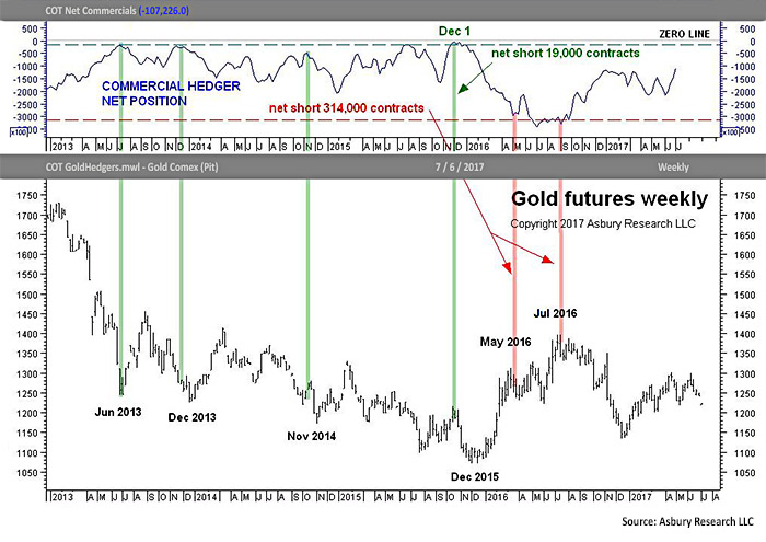
We use COT data as a value finder that answers the question “where?” That is, it indicates where we should be looking for opportunities to either buy or sell an asset. In looking at COT data, I am always particularly interested in analyzing the commercial hedger category, which is typically seen as the “smart money.” The blue line in the upper panel of Figure 1 plots the weekly net position of commercial hedgers in gold futures since 2013.
Because the large commercial firms use the futures market to hedge their holdings in the physical asset—in this case, gold—they typically accumulate a net position against the trend, which means they collectively become more net short, or more hedged, as prices rise. The red highlights define what has historically been the largest net short, or “most hedged” position, of around 314,000 contracts, while the green highlights show that a “least hedged” or smallest net short position has historically been around 19,000 contracts during this period. A corresponding weekly chart of gold futures appears in the lower panel.
FIGURE 1: COT COMMERCIAL HEDGER POSITIONS FOR GOLD (2013–2017)

The green vertical highlight in Figure 1 between both panels shows that the most recent “least hedged” extreme, around 19,000 contracts, was in early December 2015. We viewed this as an indication that the smart money viewed the $1,200 per ounce area in gold, which is where nearby futures were trading at the time, as a value area. However, it’s important to note that a value area for the commercial hedgers does not necessarily mean an actionable buying opportunity because they already own the physical commodity—in this case, gold—and have the luxury of waiting for prices to turn their way once their hedges are set.
Asset flows help to indicate when trends are changing in the broader market
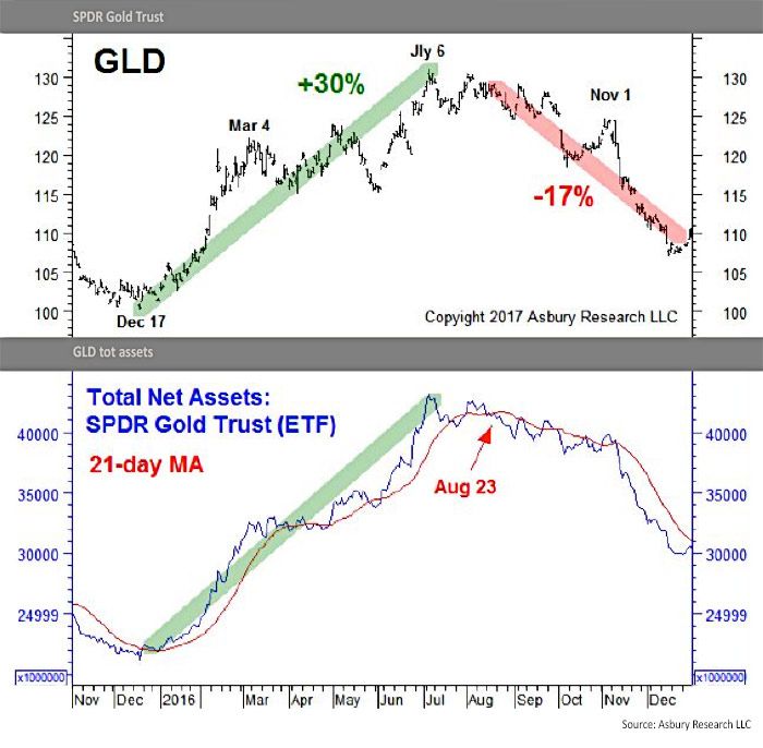
As active managers, we don’t really have that same luxury of waiting as the commercial hedgers do. We need to be more precise in our entry. For that information, we turn to the daily asset flows in the SPDR Gold Trust ETF (GLD), which answers the question “when?” The blue line in the lower panel of Figure 2 plots the daily total net assets invested in GLD between November 2015 and December 2016, along with the 21-day moving average (MA). We use the 21-day MA to determine a trend of monthly (Asbury Research’s tactical time frame) expansion or contraction. A corresponding daily chart of GLD appears in the upper panel.
FIGURE 2: PRICE TREND FOR SPDR GOLD TRUST ETF (GLD) (11/2015–12/2016)

Although the commercial hedgers identified a value area in early December 2015, the green highlight on the chart shows that the daily assets invested in GLD did not shift to a trend of monthly expansion (above the 21-day moving average) until January 4, 2016, which helped us to avoid the deeper decline into the lows of mid-December 2015. Our firm was able to get on board this new uptrend after there was some broad, positive asset flow in front to lead the way—like an offensive lineman making a hole for the halfback to run through.
Now let’s move back to Figure 1. The red vertical highlights on the right between both panels show that commercial hedgers shifted to a “most hedged” extreme of around 314,000 contracts in March 2016. This told us that we needed to keep a closer eye on the January long position in GLD as it was becoming overvalued (according to the smart money). However, the trend of monthly asset expansion shown in Figure 2 remained intact, which indicated we might still have enough “blocking” in front of the position to ride the trend a little longer.
The red vertical highlight furthest to the right in Figure 1 showed that the commercial hedgers touched “most hedged” extremes again in early July 2016, which told us again to keep a close eye on day-to-day ETF asset flows.
This time, the red highlights in Figure 2 showed that the total net assets invested in GLD moved to a trend of monthly contraction on August 23, 2016. This indicated that it was time to take profits on the GLD position and to stand aside because the big short hedge that the commercials were sitting on had filtered down to the day-to-day activity in GLD. The chart shows that this monthly trend change in asset flows helped us to capture a 30% rise in gold prices between January and August 2016, and, importantly, to avoid the subsequent 17% decline in GLD between August and year-end 2016.
***
I track many different types of market data in my role as chief investment strategist at Asbury Research, and investor asset flows are just one of these. Here’s what is unique about the two metrics discussed here:
- They represent actual monetary bets being placed by real investors, rather than some complicated derivative of price.
- They indicate the following:
- What the smart money is betting on (usually early).
- When that bet actually catches on with the rest of the market and starts to generate some volume.
This pair of metrics, especially when combined with our battery of additional market metrics, helps in our efforts to keep clients in the right asset classes at the right times.
The opinions expressed in this article are those of the author and do not necessarily represent the views of Proactive Advisor Magazine. These opinions are presented for educational purposes only.
 John Kosar, CMT, is chief market strategist and director of research at Asbury Research, which provides institutional research services. Mr. Kosar has more than 30 years of experience analyzing and forecasting global financial markets, having worked as a trader and analyst for several leading Wall Street firms. He is a past member of the board of directors of the Market Technician’s Association (now the CMT Association), is a featured speaker at many financial conferences, and is frequently quoted in the financial press. asburyresearch.com
