
A repeatable process: The only thing we can control

Consistent analysis and understanding differing market time frames are both critical in an uncertain global financial environment
The charts in this article were selected from our firm’s Monthly Investment Compass (MIC), presented to our clients on March 16, 2016. This is a comprehensive collection of our best investment ideas for the upcoming one to several months, based on the collective input of numerous different charts and metrics.
These metrics are like colors in a painting—the more you have, the more detail you can see. Ultimately, this mosaic helps inform our actively managed investment process, which can cross several different time frames. There are as many ways to devise an investment approach as there are ways to paint a picture. These metrics are a small sample of what we find works for our firm and our clients.
The following five charts from our March MIC (Exhibits 1–5) show some of the inputs into Asbury Research’s process and how they apply to different investment time horizons. While the specifics may have changed by the time you read this, it is the process that is important in understanding how we approach market analysis for multiple periods.
The long term: Know the trend and where the inflection points are
Asbury Research’s analysis is strategic for the one to two quarters following the analysis and tactical within 30 days. I always begin my analysis with the long-term time frame to identify the trend that defines our strategy. I can then move to a shorter time frame to identify our tactical decision point, where strategic ideas can potentially be both initiated and exited.
Exhibit 1 shows that the NASDAQ Composite Index failed to rise and remain above its March 2000 top-of-the-tech-bubble high back in June 2015, which immediately preceded an 18% decline into the late August lows and then a second decline of 19% following another attempt to take out this resistance in December. This chart should have warned investors not to put any new money to work after late April of last year, at least until it became clear that sustainable new 15-year highs were being made (which never happened). The risk/reward characteristics were simply not favorable.
Exhibit 1 – U.S. STOCK MARKET: PRICE AND TREND
SMALL CAP WARNS OF MORE INTERMEDIATE-TERM WEAKNESS
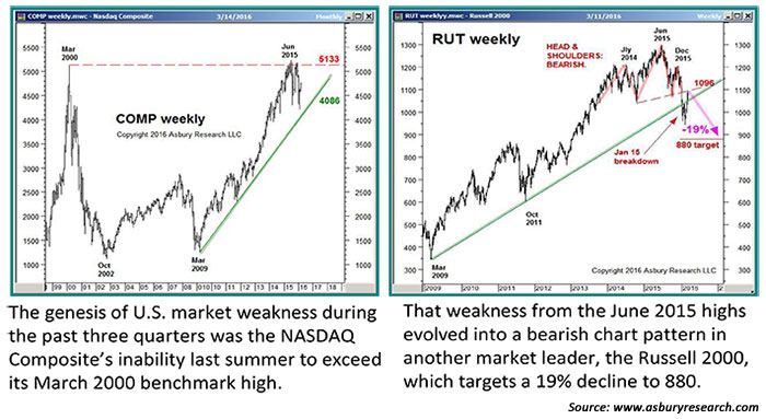
The chart on the right in Exhibit 1 shows that the small-cap Russell 2000, another market leader, broke its 2009 uptrend back in January and that the subsequent rebound is testing the lower boundary of a bearish chart pattern, near 1100, which targets an additional 20% decline to 880. These charts tell us that (1) the 2009 uptrend has stalled in technology stocks, (2) the 2009 uptrend has been broken in small-cap stocks, and (3) that the potential exists for a much deeper decline.
The intermediate term #1: Know your history
Now that we know what the long-term trend is, and the key price levels that help define that trend, we need to ascertain what is likely to happen next. There are a number of ways to do this, including cycle analysis and seasonality. The chart on the left in Exhibit 2 shows that April is the seasonally strongest month of the year in the S&P 500, based on data since 1957.
Exhibit 2 – U.S. STOCK MARKET: SEASONALITY
MARCH-APRIL STRENGTH LEADS INTO MAY-SEPTEMBER WEAKNESS
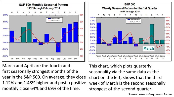
The chart on the right in Exhibit 2 displays a quarterly version of the annual chart on the left via 13 weekly bars that show the seasonal pattern during the first quarter. The chart showing the second quarter (not shown) indicates that the S&P 500 statistically peaks during the third week of April.
Combined with the directional implications of Exhibit 1, this chart warns us that the February–March rebound of the U.S. stock market may stall in a matter of weeks and potentially trigger a sustained decline into September.
The intermediate term #2: Know what’s influencing your market
The chart on the left in Exhibit 3 shows that West Texas Intermediate (WTI) crude oil was testing overhead resistance at $38.25 per barrel at the time of our report. Not shown is that oil prices have since tested and failed at major overhead resistance at $43.48 to $44.53 and are turning lower, which suggests that the larger bearish trend for oil prices is resuming.
Exhibit 3 – U.S. STOCK MARKET: INTERMARKET ANALYSIS
WTI CRUDE OIL TESTING FORMIDABLE RESISTANCE AT $38.25/BARREL
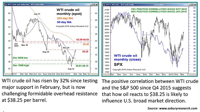
Per the correlation shown in the chart on the right in Exhibit 3, continued weakness in oil prices is likely to put downward pressure on U.S. stocks—which generally dovetails with the directional implications of the first two exhibits.
The short term #1: Know how investors are feeling
Investor fear and greed have a big influence on short-term market direction and can be measured in a number of ways, including credit spreads and market volatility. The chart on the left in Exhibit 4 shows that the CBOE Volatility Index (VIX) has been below its 50-day moving average since February 19, indicating a level of investor complacency/greed that has historically coincided with stock-market advances—until the VIX reaches extremely low levels. The VIX remains below its moving average.
Exhibit 4 – U.S. STOCK MARKET: VOLATILITY
NEAR-TERM POSITIVE, BUT WATCH 12.00 IN THE VIX
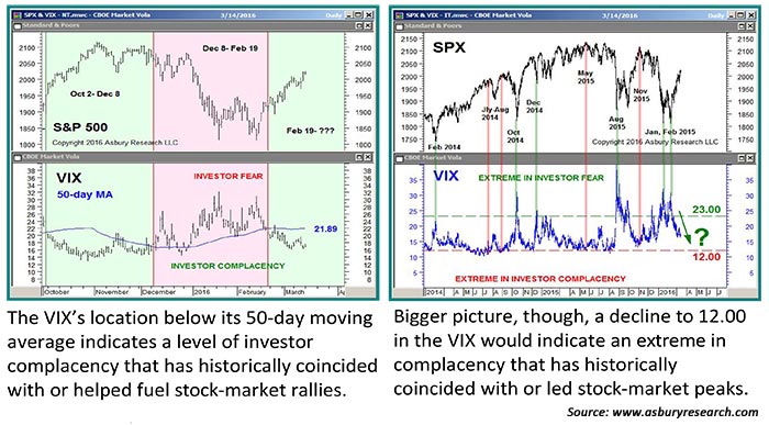
The chart on the right in Exhibit 4 shows that too much complacency/greed can be a bad thing, as declines into the 12.00 area have historically coincided with stock-market peaks. The VIX is currently at 13.95, which also supports the warning in the previous three exhibits of an emerging market top.
The short term #2: Investor asset flows drive prices
Exhibit 5 plots the daily total net assets invested in the SPDR S&P 500 (SPY) and PowerShares QQQ ETFs, which were both above their 21-day moving averages. This indicates a monthly trend of expansion that is characteristic of healthy near-term advances. (Note: Asbury Research is strategic to the quarter and tactical to the month, so we use a 63-day moving average as a baseline for our strategic metrics and a 21-day moving average as a trigger for our tactical tools.)
Exhibit 5 – U.S. STOCK MARKET: ETF ASSET FLOWS
NEAR-TERM POSITIVE
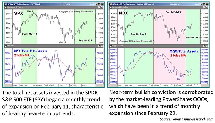
The total net assets in both metrics are still above their 21-day moving averages (as of this writing), which is near-term bullish for the market. However, the total net assets in the QQQs have been contracting recently, up until Federal Reserve Board Chair Janet Yellen’s dovish comments on March 29. This trend had been indicating that investors were starting to lose bullish conviction in the market leader QQQs. If and when these assets contract below their moving average to indicate a monthly trend of contraction, it will probably be the first indication that a near-term market top is in place.
***
This simple, logical, and repeatable methodology employs a diverse set of metrics that “take the market’s temperature” in a number of different ways for three different time frames. No matter what the economic backdrop or geopolitical influences, the market will always (1) indicate the trend via price, (2) generally follow seasonal/cyclical patterns, (3) be influenced by statistically significant correlations, (4) be mostly driven by fear and greed over the near term, and (5) ultimately be dependent on investor asset flows for direction.
The purpose of this article was not to define these particular tools as “the” best ones for money managers or advisors to use. Our full report and analysis of March 16, 2016, included 21 different chart observations, and the metrics included in the other 16 are every bit as important as the ones that appear here. The point is that a diverse set of tools—whatever they may be—will generate directional signals in different investment time horizons. These can then be used to implement a repeatable investment process. This helps keep a manager’s or advisor’s analytical process objective, logical, and consistent—no matter what the environment.
 John Kosar, CMT, is chief market strategist and director of research at Asbury Research, which provides institutional research services. Mr. Kosar has more than 30 years of experience analyzing and forecasting global financial markets, having worked as a trader and analyst for several leading Wall Street firms. He is a past member of the board of directors of the Market Technician’s Association (now the CMT Association), is a featured speaker at many financial conferences, and is frequently quoted in the financial press. asburyresearch.com