How sentiment measures can help in formulating investment strategies

Investor sentiment metrics provide valuable insights on what the “investment crowd” is thinking, often helping to identify important market tops and bottoms.
As an analyst with 35 years of experience who makes a living by forecasting the future direction of financial asset prices (with a goal of finding opportunities before the rest of the world catches on), I look at virtually every category of analytical tool imaginable.
There are many technical metrics—including moving averages, trend lines, and momentum gauges—that investors can use to quantitatively determine when a price trend begins and ends. The limitation of these metrics is that they are typically lagging indicators. By the time it becomes apparent that the trend has changed, the price of the asset has already made a significant move in the opposite direction.
Investor sentiment metrics, however, can tell us what is happening inside the market during that price trend—that is, the quality of the trend. Asbury Research tracks a robust and diverse group of these more qualitative investor-sentiment indicators and separates them into two categories: survey-based and asset-flow-based metrics. I acknowledge that by strict definition investor asset flows may not fit into the investor sentiment category, but I have found that when combined with survey-based measures, they can collectively provide a more robust, comprehensive, and accurate way to view investor opinion and how it is likely to influence the direction of asset prices.

Importantly, most of these metrics are contrary indicators. This thought is based on the assumption that the vast majority of investors are typically “the most wrong” about price direction at the major market turns. That is, asset prices typically peak when investors are collectively the most bullish and bottom when they are the most bearish. Of these two types of metrics, I have found that the asset-flow-based metrics are generally more sensitive, accurate, and useful, because they are based on investors with real money at stake in the market. Opinions can change free of charge, but real assets invested force investors to decide, every day, whether or not to remain in the market.
That being said, I have found that tracking a large and diverse group of sentiment indicators, looking for corroboration and confirmation, provides useful depth and color on the market. While it is a labor-intensive exercise, it is well worth the time invested. Eight investor sentiment metrics that I track every week are presented below, along with a brief description and commentary on how I integrate them into my investment strategy thinking.
Survey-based indicators
NAAIM Exposure Index
The NAAIM (National Association of Active Investment Managers) Exposure Index is a weekly survey that represents the average exposure to U.S. equity markets as reported by the association’s membership. I have found this survey to represent an intermediate-term perspective, which I define as being one to two quarters in length.
Figure 1 plots the NAAIM Exposure Index (lower panel) and the corresponding weekly chart of the S&P 500 (SPX) (upper panel). I have defined 85% and 14% as the most bullish and least bullish extremes in the index based on the range of the survey during the past decade.
FIGURE 1: NAAIM EXPOSURE INDEX VS. S&P 500
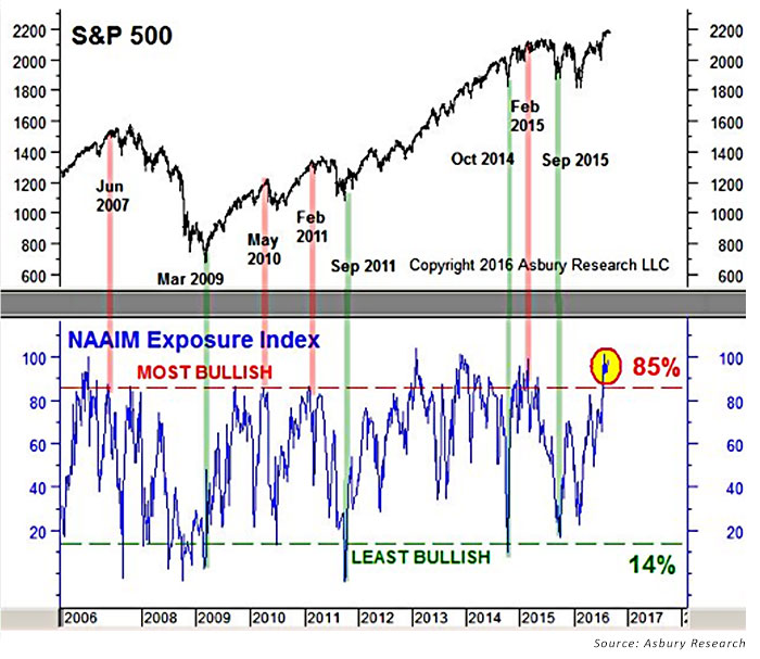
The red highlights show that every meaningful peak in the SPX since 2006 has coincided with a most bullish extreme in the survey, while the green highlights point out that the least bullish extremes have coincided with every meaningful bottom. The chart also shows that there were many instances, especially the most bullish ones, that did not correspond with a significant U.S. broad market peak. This is precisely why I take the time to look at a number of similar but different metrics to try to find a collective message in the data, rather than relying on any one of them to identify a potential market top or bottom.
AAII Bull Ratio
The AAII (American Association of Individual Investors) Bull Ratio is another weekly survey. This one displays the percentage of the AAII’s retail investor membership that is bullish on the stock market for the next six months, divided by those that are bearish for the next six months. Though this survey supposedly looks six months ahead for stock prices, I have found it to be more frenetic and more representative of a near-term time frame (one to three months).
Figure 2 plots this ratio from 2006 to late 2016 (lower panel) and a corresponding weekly chart of the S&P 500 (upper panel). I have defined 69% and 27% as most bullish and least bullish extremes in this metric based on its range during the past decade.
FIGURE 2: AAII BULL RATIO VS. S&P 500
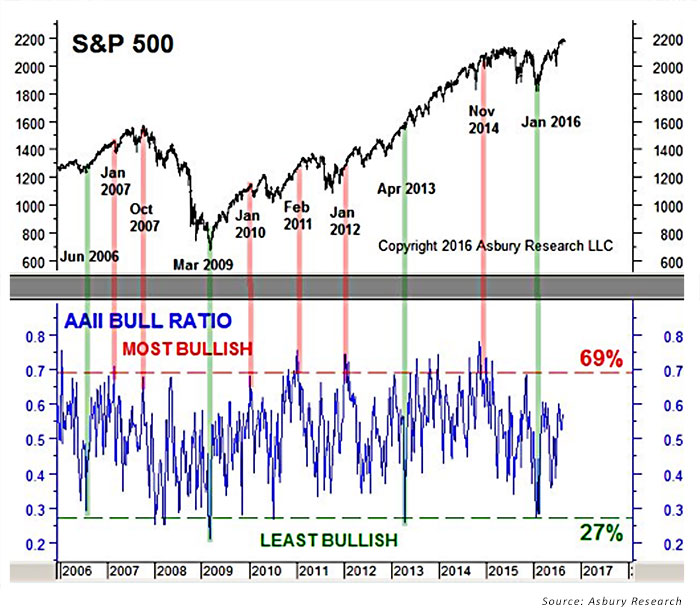
As in Figure 1, I used red and green highlights to connect the extremes in the ratio to levels in the S&P 500. They show that only some of these extremes have coincided with meaningful peaks and bottoms in the index. This is why looking at multiple surveys for confirmation is an important part of deriving useful information from them.
Daily Sentiment Index
The Daily Sentiment Index (DSI) is a daily survey of how bullish individual futures traders are on a broad list of contracts, including equity indexes, government bonds, currencies, and commodities. The futures traders represented in the survey tend to be near-term-trend followers, with a typical investment time horizon of one to two months. They also tend to be the most bullish at market tops and the most bearish at market bottoms.
Investors Intelligence Survey, Bulls Minus Bears
The Investors Intelligence Survey (IIS), Bulls Minus Bears, which began back in 1963, questions stock-market newsletter writers once a week to determine if they are bullish or bearish on the stock market over the near term. The Bulls Minus Bears version of the survey plots the difference between the bullish and bearish respondents. Interestingly, even though this is supposedly a near-term indicator, the chart shows less oscillation between the most bullish and most bearish extremes than the previous two charts. I believe this is due to the longer investment time horizon of the newsletter writers being surveyed.
FIGURE 3: INVESTORS INTELLIGENCE SURVEY VS. S&P 500
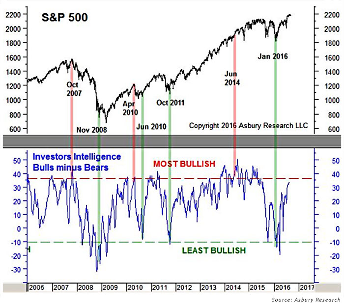
Note that all three charts presented so far show a most bullish extreme between June and October 2007, which was a major market top, and a most bearish extreme between November 2008 and March 2009, which was a major market bottom. This is the important corroboration/confirmation between different indicators mentioned earlier, which tends to help identify major turning points in the market.
Market Vane Survey
The Market Vane Survey has been tracking the daily buy and sell recommendations of leading market advisors and commodity trading advisors (CTA) since the 1970s. The survey keeps track of a wide range of financial prices, including the stock market, U.S. Treasurys, the U.S. dollar, and a broad list of commodity prices. These professional trend followers typically operate within what I would call an intermediate- to longer-term time frame (one to three quarters). The Market Vane has a particular value in my analysis because the investment time horizon is one of the longest of those I track.

Asset-flow-based indicators
Futures open interest/commitments of traders (COT) data
Futures open interest is the total number of outstanding contracts, both long and short, that have not expired or fulfilled by delivery. Once per week, the Commodity Futures Trading Commission breaks futures open interest down into several different categories. The one I pay the most attention to is the Commercial Hedger category because it represents the net position of entities that are actively engaged in the underlying business and that use the futures market to hedge their physical holdings in that particular asset. An example of this would be a corn farmer who uses the futures market to lock in a good price for his yet-to-be-harvested crops while corn prices are high.
Financial firms can also use the futures market to hedge their holdings. Figure 4 plots the weekly net position of commercial hedgers in the CBOT 30-year T-bond contract over the past decade (upper panel) and a corresponding weekly price chart of the T-bond (lower panel).
FIGURE 4: WEEKLY NET FUTURES POSITION OF COMMERCIAL BOND TRADERS VS.
BOND PRICE TREND
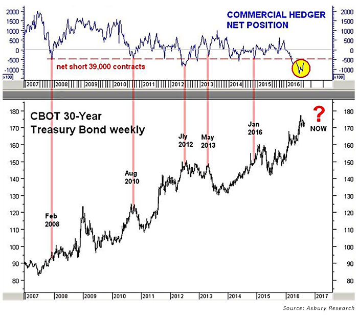
The red highlights show that an extreme net short position of 39,000 contracts by these hedgers (as of late August 2016), who likely represent money center banks or other financial firms. These types of extreme positions have closely coincided with some of the most important peaks in the T-bond during the charted period. These positions represent an aggressive bet by smart money “insiders” that long-dated U.S. Treasurys are overvalued and long-term U.S. interest rates are bottoming.
Contrary to the other trader demographics represented thus far, commercial hedgers are not trend followers that become the most bullish at market peaks and most bearish at market bottoms. Rather, they are market insiders who accumulate a net position against the trend.
CBOE put-call ratio
This metric reveals what options traders are thinking about by measuring the daily volume of put versus call options at the Chicago Board Options Exchange. This is another metric that has a trend-following dynamic to it.
The red highlights in Figure 5 show that a least bearish extreme in this metric—that is, a historically low amount of put volume versus call volume—has coincided with many of the near-term peaks in the S&P 500 during the past year. This means that the times when options traders are buying the least amount of protection (puts) against a market decline tend to represent precisely when most declines begin.
FIGURE 5: CBOE PUT/CALL RATIO (INVERSE SCALE) VS. S&P 500 (SPX)
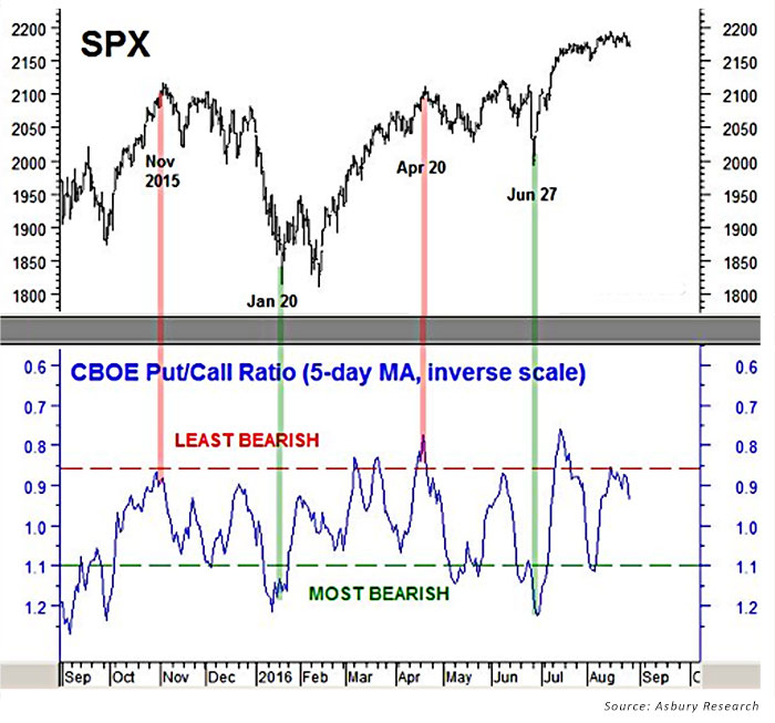
Conversely, the green highlights show that most bearish extremes in the ratio, when the ratio of daily put volume versus call volume is the highest and these traders are seeking the most downside protection, is typically when market bottoms emerge.
ETF asset flows
I have become very interested in ETF asset flows over the past few years because they are one of the few metrics I have come across that actually lead price. Total net assets, which are derived from multiplying shares outstanding by net asset value, represent investor conviction in a price trend. Program trading can run an index up and down all day long, from the opening to the closing bell, but total net assets only measure those positions being held overnight. And those positions represent the investor conviction necessary to sustain a price trend.
Figure 6 plots the daily total net assets invested in the SPDR S&P 500 ETF (SPY) since January, along with their 21-day moving average (lower panel), versus the overall price trend of the SPX (upper panel). The trend is particularly useful for defining a monthly trend of expansion or contraction.
FIGURE 6: SPY ETF ASSET FLOWS VS. S&P 500 (SPX) PRICE TREND
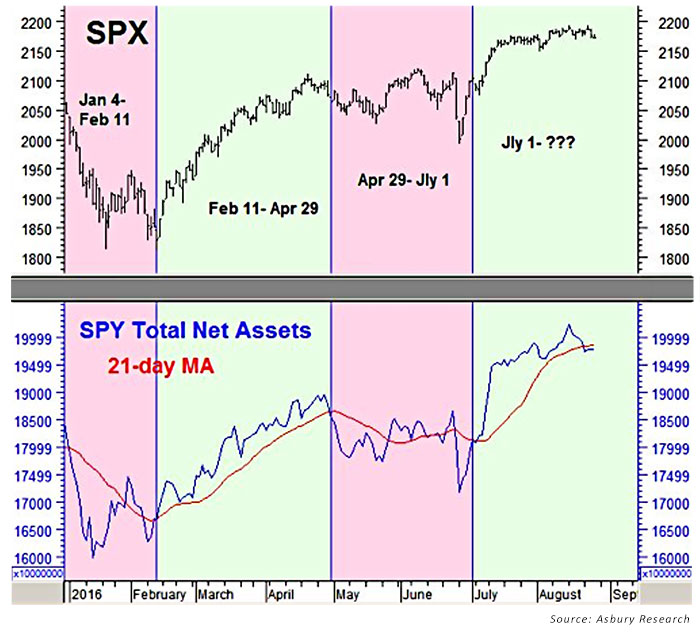
The colored highlights show that periods of monthly asset expansion have coincided with a rising S&P 500 (SPX, upper panel), and that periods of monthly asset contraction have coincided with U.S. broad market declines. This metric displays investor sentiment (in terms of real-time behavior) on a very near-term cause-and-effect basis. It is particularly important as it accurately signifies broad upcoming changes in market direction, which can then be further confirmed using the other metrics reviewed earlier. The moving average aspect of this analysis is particularly important for identifying trend changes.
…
Key takeaways regarding sentiment measures
There are several additional sentiment measures that can add value to the overall market picture, but I find those identified above to be of most value.
My key takeaways after decades of performing this analysis?
- Using multiple sentiment indicators is critical. Each one tends to represent a different segment of market participant, each with their own unique investment time horizon, and adds to the overall picture with that perspective in mind.
- Trends over time are far more important than short-term volatility in the measures.
- Most sentiment indicators perform best as contrarian indicators, with their greatest value at market extremes.
- The accelerated growth and importance of ETFs, combined with today’s sophisticated data resources, has elevated the evaluation of ETF asset flows to a position of prime importance in my overall analytical framework.
 John Kosar, CMT, is chief market strategist and director of research at Asbury Research, which provides institutional research services. Mr. Kosar has more than 30 years of experience analyzing and forecasting global financial markets, having worked as a trader and analyst for several leading Wall Street firms. He is a past member of the board of directors of the Market Technician’s Association (now the CMT Association), is a featured speaker at many financial conferences, and is frequently quoted in the financial press. asburyresearch.com
