

Small-cap stocks have been underperforming large ones since mid-2018, and this underperformance should continue until the end of 2020.
Figure 1 shows a relative-strength line (green) for the Russell 2000 Index (R2) versus the Russell 1000 (R1). It is a very simple calculation, dividing the R2 value by the R1 value. When the line is rising, that means small-cap stocks are outperforming on a relative basis. That outperformance can mean going up more quickly or going down more slowly. If you are an investor in small-cap-related stocks or ETFs, you want this line to be rising.
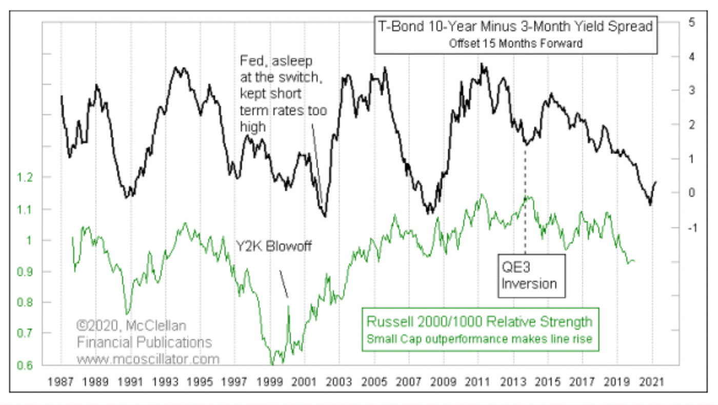
Source: McClellan Financial Publications
Also included in this chart is a measure of the yield spread between 10-year and three-month Treasurys (black line). That plot is shifted forward by 15 months to help us see how its movements tend to repeat in the R2/R1 relative-strength line. It does not always repeat perfectly, especially when the Fed puts a thumb on the scale. But, in general, the relative-strength line echoes the dance steps of the yield curve.
That is important because, on a monthly closing basis, that yield spread bottomed in August 2019. Counting 15 months forward, we get November 2020 for when the relative-strength line should ideally find its own bottom. That means around 10 more months of underperformance of small-cap stocks from here.
This 15-month lag is also important in other ways. Here is that same spread between 10-year and three-month yields compared to the quarterly change in GDP, once again using a 15-month forward offset (Figure 2).
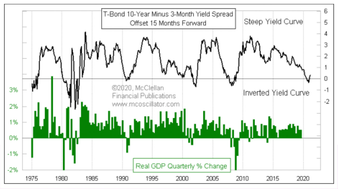
Source: McClellan Financial Publications
Everyone already knows that an inverted yield curve is a warning sign of an economic recession. But what is interesting is that if we run Pearson’s correlation coefficient for these two plots in real time, they only have a +0.05 correlation factor. In other words, no correlation at all, according to that statistic.
But if we adjust that calculation for the 15-month lag, then the correlation jumps up to +0.29. That’s far from a perfect correlation, and the somewhat low correlation score comes about because the magnitudes of the two plots’ movements are sometimes not equal. But what we care about is the direction of movement and when GDP growth turns negative. On that basis, the periods of inversion have a really good track record.
Perhaps the most interesting point about this 15-month offset is that the timing of the August 2019 bottom for this yield spread means that November 2020 is when small-cap relative strength and U.S. economic growth should be bottoming out. And that is when the U.S. will hold its next presidential and congressional elections. Watch for the topics getting debated among the candidates to start shifting to economic growth themes.
The opinions expressed in this article are those of the author and do not necessarily represent the views of Proactive Advisor Magazine. These opinions are presented for educational purposes only.
This is an edited version of an article that first appeared at McClellan Financial Publications on Jan. 23, 2020.
 Tom McClellan is the editor of The McClellan Market Report newsletter and its companion, Daily Edition. He started that publication in 1995 with his father Sherman McClellan, the co-creator of the McClellan Oscillator, and Tom still has the privilege of working with his father. Tom is a 1982 graduate of West Point, and served 11 years as an Army helicopter pilot before moving to his current career. Tom was named by Timer Digest as the #1 Long-Term Stock Market Timer for both 2011 and 2012. mcoscillator.com