
Let’s be realistic about drawdowns
Let’s be realistic about drawdowns

Portfolio drawdowns are a fact of life for professional investment managers and financial advisors—and the clients who depend on both of them. Understanding the nature of drawdowns—and the relationships of various investment vehicles on a risk-adjusted basis—is a first step toward better management of overall portfolio risk.
Drawdowns.
You can have a greater number of small drawdowns or fewer big ones.
You can scale your total risk up or down, but then you also scale your returns.
You can act like the Federal Reserve and the U.S Treasury Department and try to avoid risk situations that have happened in the past—but then the next risk is something we’ve never seen before.
The most common way for individual investors to control risk is with a stop-loss order. That doesn’t always work effectively because the closer you place the stop-loss, the more often it is hit.
It all comprises the “risk” part of “risk and reward.” Still, investment managers, financial advisors, and investors have better choices.
If you’ve been managing investments for a long time, you’ve seen risk of all shapes and sizes: some that you can expect and some shocks that you need to deal with afterward. What you haven’t seen are riskless investments. Let’s look at how to assess risk and some realistic ways to lower risk.
As our basis for comparison, we’ll use the SPDR S&P 500 ETF (SPY), high-grade corporate bonds (HYG), preferred stocks (PFF), a Vanguard bond fund (BND), municipal bonds (MUB), the U.S. dollar index (UUP), and the Goldman Sachs Commodity Index Trust (GSG). We’ll look at the data from 2007 through Feb. 20, 2019, to allow for inclusion of all of the ETFs. That period also spans one of the largest market sell-offs in the post-WW II era, an equally unprecedented bull market, and more volatile recent activity, making it a good data sample.
To measure return and risk, financial analysts use the annualized rate of return (AROR) and define risk as one standard deviation of the daily returns. To be clear, one standard deviation means that there is a 16% chance that the risk will be larger than the calculated value, and the truth is that it will be much larger. On the other hand, the calculation of returns is not a probability but rather the actual annualized return over the period from 2007. Figure 1 shows the AROR and the risk, measured as one standard deviation, for our sample investment selections.
FIGURE 1: COMPARING RETURNS TO STANDARD RISK (2007–2019)
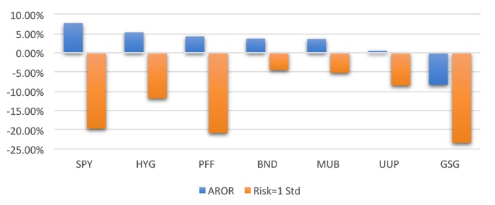
Source: Perry Kaufman, data from Commodity Systems Inc. (CSI)
Notice that the magnitude of the risk is much bigger than the returns. Unless you’re holding risk-free government paper, this is always going to be true. During this period, which was mostly a bull market, SPY had the highest return but also high risk. HYG has a lower return but much lower risk. Bonds have an even lower return but much lower risk. But these risks are probabilities, not actual drawdowns. We can compare the theory with reality by looking at the maximum drawdown compared to the standard risk measurement during the same period. Figure 2 shows that the maximum drawdown is much larger than the risk measured as one standard deviation. In fact, on average, the maximum drawdown is 2.75 times greater than the risk measurement.
FIGURE 2: MAXIMUM DRAWDOWN IS 2.75 TIMES THE STANDARD RISK MEASUREMENT
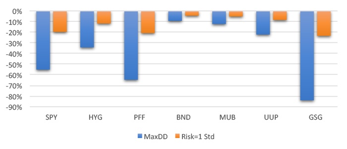
Source: Perry Kaufman, data from Commodity Systems Inc. (CSI)
The good news is that the drawdowns are found over the entire time period, about 12 years. Most of the worst drawdowns would have occurred in 2007–2009, the financial crisis. You can argue that it was an unusual period, not likely to be repeated. But we say that for each new crisis!
Over the history of the U.S. stock market, given a long enough period of time, equity investors have been rewarded with growth in their portfolios. However, they have obviously faced periods of extreme volatility and steep drawdowns for those same portfolios.
According to data from Yardeni Research, every decade since 1920, with the exception of the 1990s, has had at least one market decline over 20% (the 2010s have seen two declines over 19%). Most of these declines were much worse.
TABLE 1: WORST MARKET DECLINES BY DECADE (1920S–PRESENT)
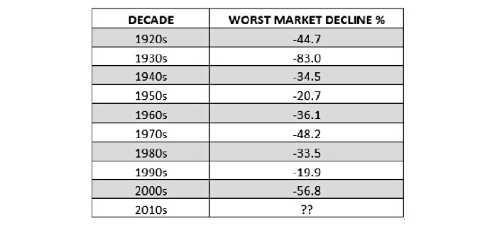
Declines measured from peak to trough of correction period.
Source: Yardeni Research, market data
What can we do about the risk? The two most obvious ways to combat risk are diversification and selection. Diversification means investing in assets that have different return and risk patterns. Unfortunately, that works only when you don’t need it. In 2007–2009, as in other extreme periods, most asset classes reversed at the same time. Investors exited the equity market and sold other assets to cover losses. That action caused most investments to decline, even if they had nothing to do directly with the crisis.
We can follow a systematic strategy that includes a stop-loss or some other risk-moderating techniques that are intended to control the maximum drawdown. We know you can reduce the individual risk of a trade or position with a stop-loss of, say, 10%. However, what happens is that you have a lot more losses of 10% when many of those stocks or ETFs turn around and make new highs. Had you done that during the recent December 2018 sell-off of close to 20%, you might still be out of the market and missed the recovery—or been slow to re-enter and missed a good portion of gains. The closer you place your stop, the more often it is hit. If you place it too close, you get stopped out on almost every trade.
The simplest way to keep risk under control is to include markets that have intrinsically lower risk.
Unfortunately, lower risk goes hand in hand with lower returns. You can’t have both. If you are willing to risk a 55% drawdown to earn an average of 7.7%, then investing in the broad index is your solution.
But many other investors would be more comfortable with a 10% risk. When inflation is under 2%, then earning nearly 4% still keeps you ahead. To see which ETFs offer the best “payout,” we divide the annualized returns by the annualized standard deviation to get the “return ratio,” again using data from 2007–2019. The higher the return relative to the risk, the better the risk-adjusted payout. In Figure 3, we see that Treasury bonds have the best payout, followed by municipal bonds. The GSCI commodity index was the worst performer during the measured period.
FIGURE 3: RETURN RATIO SHOWS THE RISK-ADJUSTED PAYOUT
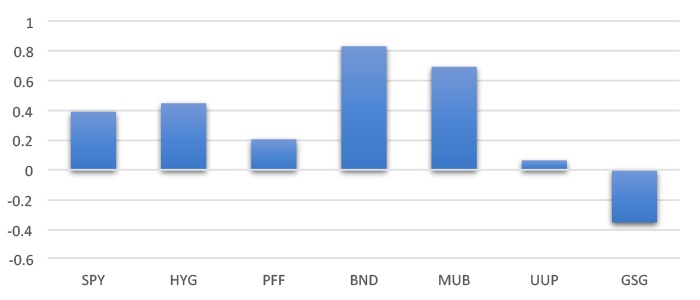
Source: Perry Kaufman, data from Commodity Systems Inc. (CSI)
For those seeking to visualize the risk-adjusted ratio, think of the efficient frontier. It’s the curve that represents the best return at each level of risk for a set of investments that form a portfolio, or even for individual equities. It makes the assumption that a rational investor will choose the highest return for the same risk, or the lowest risk for the same return. The return ratio that we use is the optimal point on that efficient frontier. It is the point where the straight line, drawn from the left axis at the risk-free interest rate, is tangent to the curve (Figure 4).
FIGURE 4: THE EFFICIENT FRONTIER AND THE OPTIMAL RISK-ADJUSTED RETURN
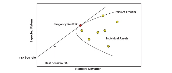
CAL refers to capital allocation line.
Source: Wikipedia, “Efficient Frontier”
There is a reason why professional managers add bonds to a client portfolio. It reduces the overall risk of investing in equities, which have a lower risk-adjusted payout. Preferred stocks, currencies (the USD Index), and commodities (GSCI) all have relatively higher risk compared to their return over the period studied. They may have offered diversification in a large portfolio, but they might be better used in smaller allocations versus other investment classes. (It might be a little surprising to some that preferred stocks had higher risk during this period. The major reason is that PFF is heavily skewed toward the Financial Services sector.)
We seem to be able to deal with drawdowns that recover quickly, but the ones like those following the internet bubble of 2000 and the financial crisis of 2008 are best avoided. Wouldn’t it be nice if you could know when a prolonged drawdown will occur? In a way, the Federal Reserve and the banking sector do just that.
Banks set their prime rate, the rate they will lend money to their most-favored customers, based on the fed funds rate. They try not to change it often, and they resist lowering it because it lowers their income/profit margin. They do lower it, however, when they see a serious problem in the economy. Investment managers and investors may find it to be a better leading indicator than the fed funds rate.
Look at Figure 5, a history of the prime rate. On Oct. 5, 1987, the stock market started one of its major declines. On Oct. 7, 1987, the prime rate rose 50 basis points based on an evaluation of a strong economy. On Monday, Oct. 19, the S&P sold off 22% after a drop of 10% from the previous Wednesday. On Oct. 22, only three days later, and then again on Nov. 5, the prime rate was lowered by 25 basis points, the first moves lower in some time.
FIGURE 5: THE PRIME RATE FROM 1983 TO 2019
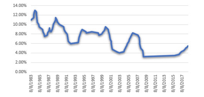
Source: P. Kaufman, based on data from JPMorgan Chase
The internet bubble burst at the beginning of 2000, with the market sell-off starting slowly but lasting more than two years (see Figure 6). The prime rate first dropped on Jan. 4, 2001, by 50 basis points and continued lower until Sept. 21, 2004. Although this prime rate “indicator” was somewhat slow to react, reducing exposure based on it would still have helped an investor avoid about 50% of the total loss for the period.
FIGURE 6: QQQ ETF DURING THE DOT-COM MARKET DECLINE
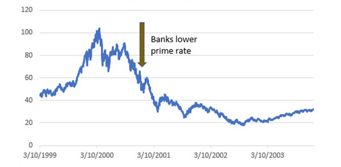
Source: P. Kaufman, data from Commodity Systems Inc. (CSI)
At the end of June 2006, the prime rate rose 25 basis points to 8.25%, which proved to be its final move ahead of the financial crisis. On Sept. 18, 2007, the prime rate started its decline. Unlike the internet bubble, this move in the prime rate anticipated the major market decline (see Figure 7). Banks did not start raising the prime rate again for more than eight years.
FIGURE 7: PRIME RATE DROP ANTICIPATES 2008–2009 S&P 500 DECLINE
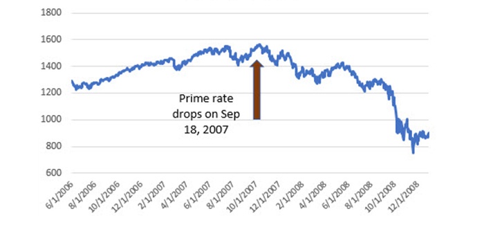
Source: P. Kaufman, data from Commodity Systems Inc. (CSI)
Markets become more volatile when individual stocks get more volatile or when global events get heated up. If you had entered the market 100% in stocks during the bull run between 2009 and 2015, you would have had an annualized risk of about 15% (see Figure 8). Given the history of the S&P 500, that’s low. If you structured your portfolio to be 60% stocks and 40% bonds, then your risk would be 9% for the total portfolio. That makes it unlikely you would see a loss of 20%.
FIGURE 8: COMPARING SPY TO HISTORICAL VOLATILITY
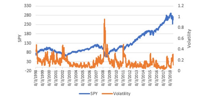
Source: P. Kaufman, data from Commodity Systems Inc. (CSI)
It is important to note that the prime rate was not lowered during the past six months, despite the drop of close to 20% in equity prices. That means the decline in stock prices was not considered a broad economic event, unlike the internet bubble or the financial crisis of 2007–2009.
Financial managers are well-advised to watch how the Fed and banks react to different market scenarios. They lower rates when they expect a prolonged drawdown and hold pat when they do not. The key action is when they lower rates after a long period of increasing rates. They can act quickly. On the other end, when it’s time to raise rates, they tend to be slower. Much like stock prices, rates can decline quickly and rise slowly.
Controlling drawdowns is one of the most important responsibilities of an active investment manager—and the financial advisors who work with them on behalf of their clients. But managers are not magicians. Typical portfolios hold long positions and price shocks nearly always send prices lower. The ways to avoid large drawdowns are to have a very well-diversified portfolio with multiple strategies/asset classes, reduce exposure if necessary (even all the way down to zero), invest some portion of the portfolio in assets with lower risk (and lower return), target a better return-to-risk ratio, and watch the bank rates to see when a decline in equities is just a blip or a more serious event.
The opinions expressed in this article are those of the author and do not necessarily represent the views of Proactive Advisor Magazine. These opinions are presented for educational purposes only.
 Perry Kaufman is a financial engineer specializing in algorithmic trading. He is best known for his book, “Trading Systems and Methods,” (fifth edition, Wiley, 2013) and recently published “A Guide to Creating a Successful Algorithmic Trading Strategy” (Wiley, 2016). Mr. Kaufman has a broad background in equities and commodities, global macro trading, and risk management. Find more information at his website: www.kaufmansignals.com